Visualized Data Fails Climate
Maissam Attie
Climate science as a data-intensive subject has been enormously affected by the age of Big Data. Over the past few decades, and especially with the twenty-first century’s digital age, information can now rapidly shape-shift from infographics to pure technological holographic images, leaving users wondering if the information portrayed is imagined or not. Climate data visualizations are failing to communicate to the public because design, which has the potential to convey this reality differently, is failing to transmit the very idea that climate change is not just a conceptual story that comes from applying data-mining techniques to project information that is modeled, forecasted and derived from Big Data. This is not scaremongering, this is science.
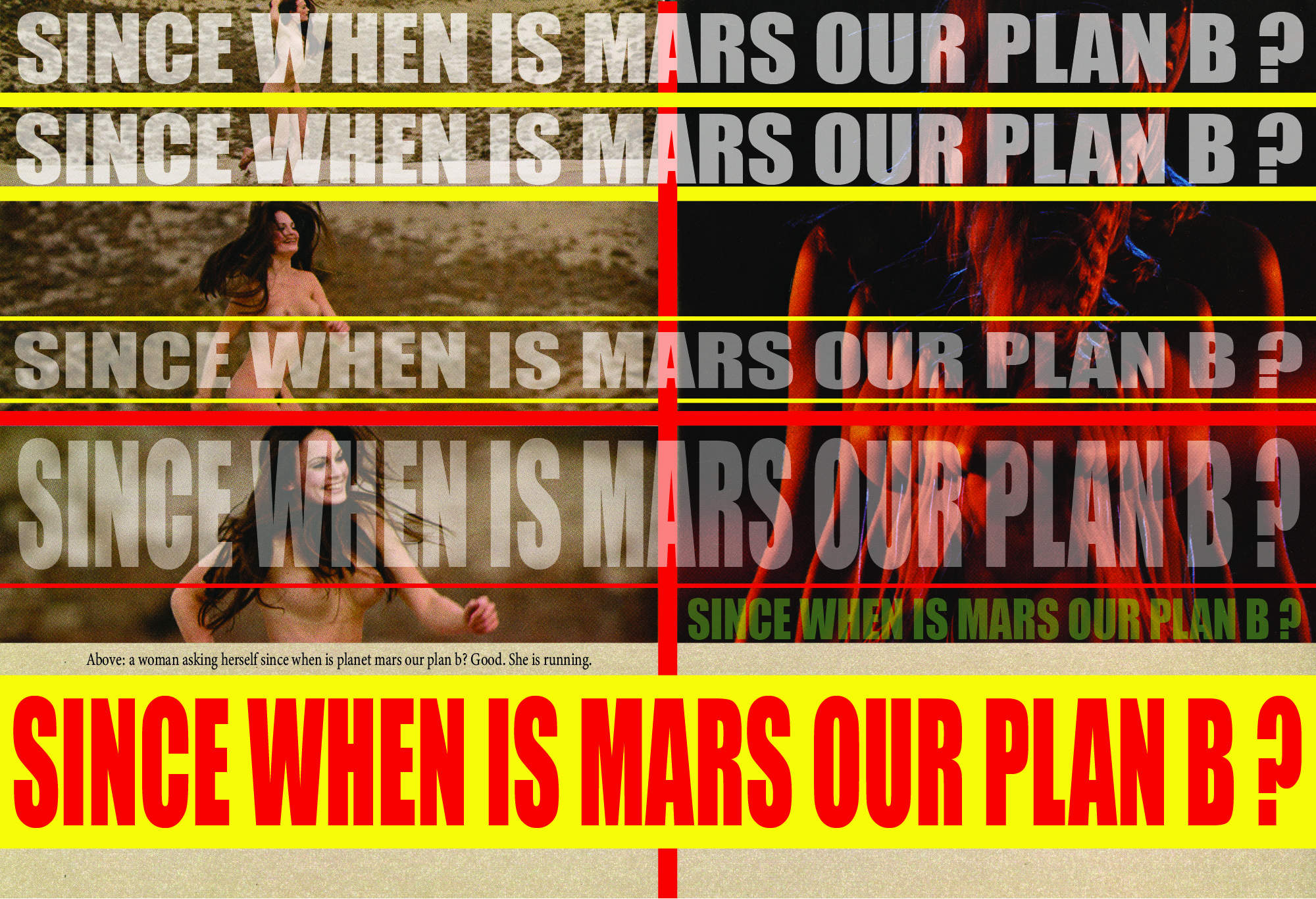
Since When is Mars our Plan B?
* to be featured in the AD ART SHOW 2020 in The Oculus at Westfield World Trade Center, Sep 29, 2020. mvvoart.com. *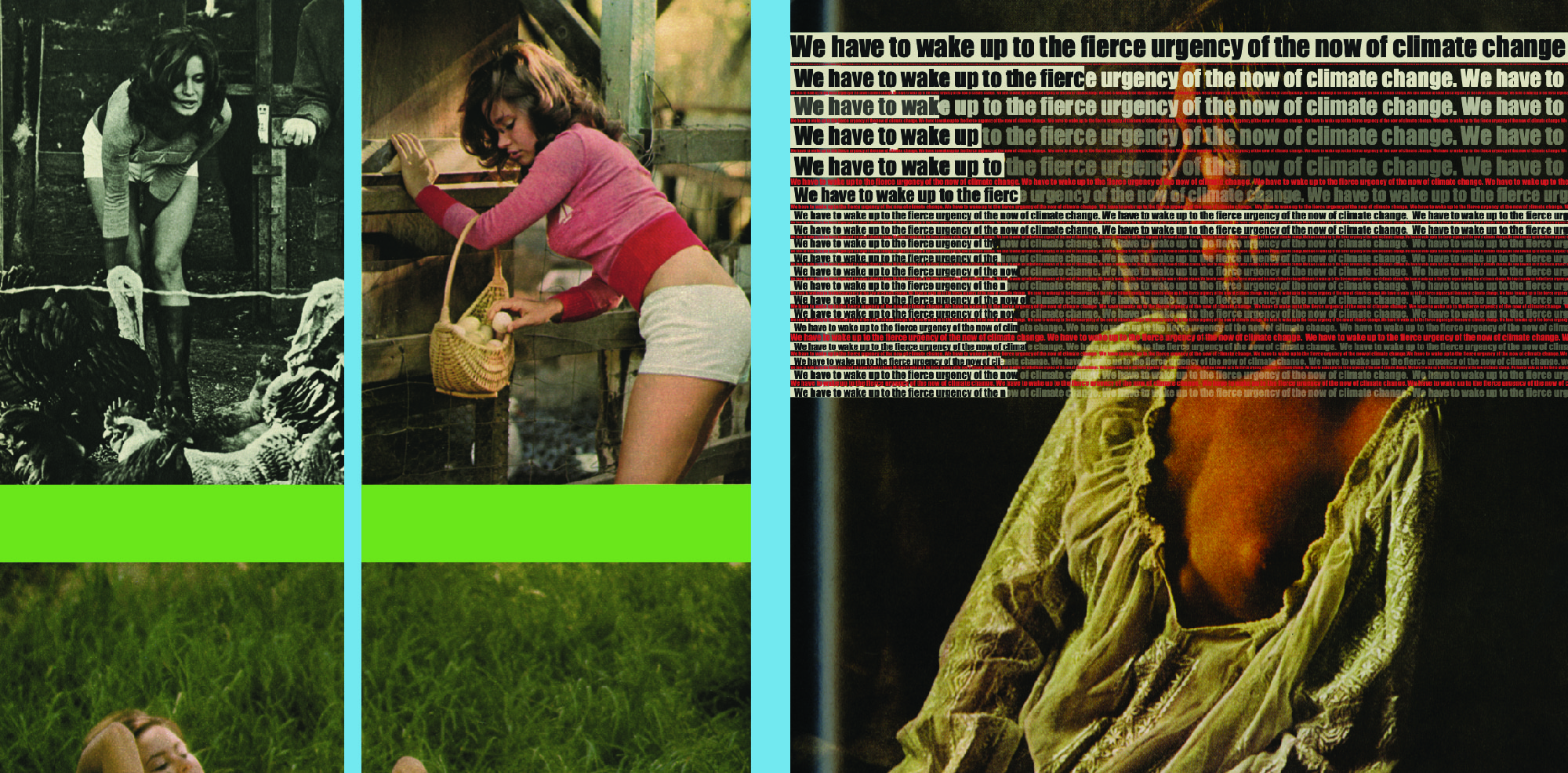
The Urgency of the Now of Climate Change.
* to be featured in the AD ART SHOW 2020 in The Oculus at Westfield World Trade Center, Sep 29, 2020. mvvoart.com. *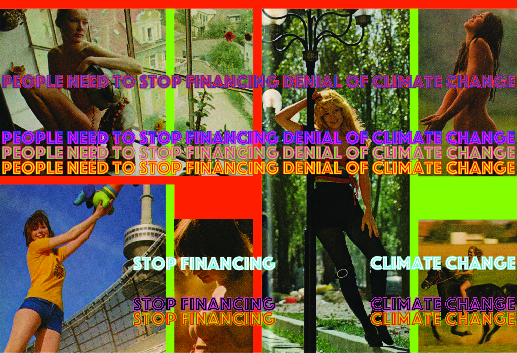
Stop Financing Denial of Climate Change.
* to be featured in the AD ART SHOW 2020 in The Oculus at Westfield World Trade Center, Sep 29, 2020. mvvoart.com. *
World Leaders are Failing our Future Generations on Climate Change.
* to be featured in the AD ART SHOW 2020 in The Oculus at Westfield World Trade Center, Sep 29, 2020. mvvoart.com. *
I feel the gripping sensation of the end.
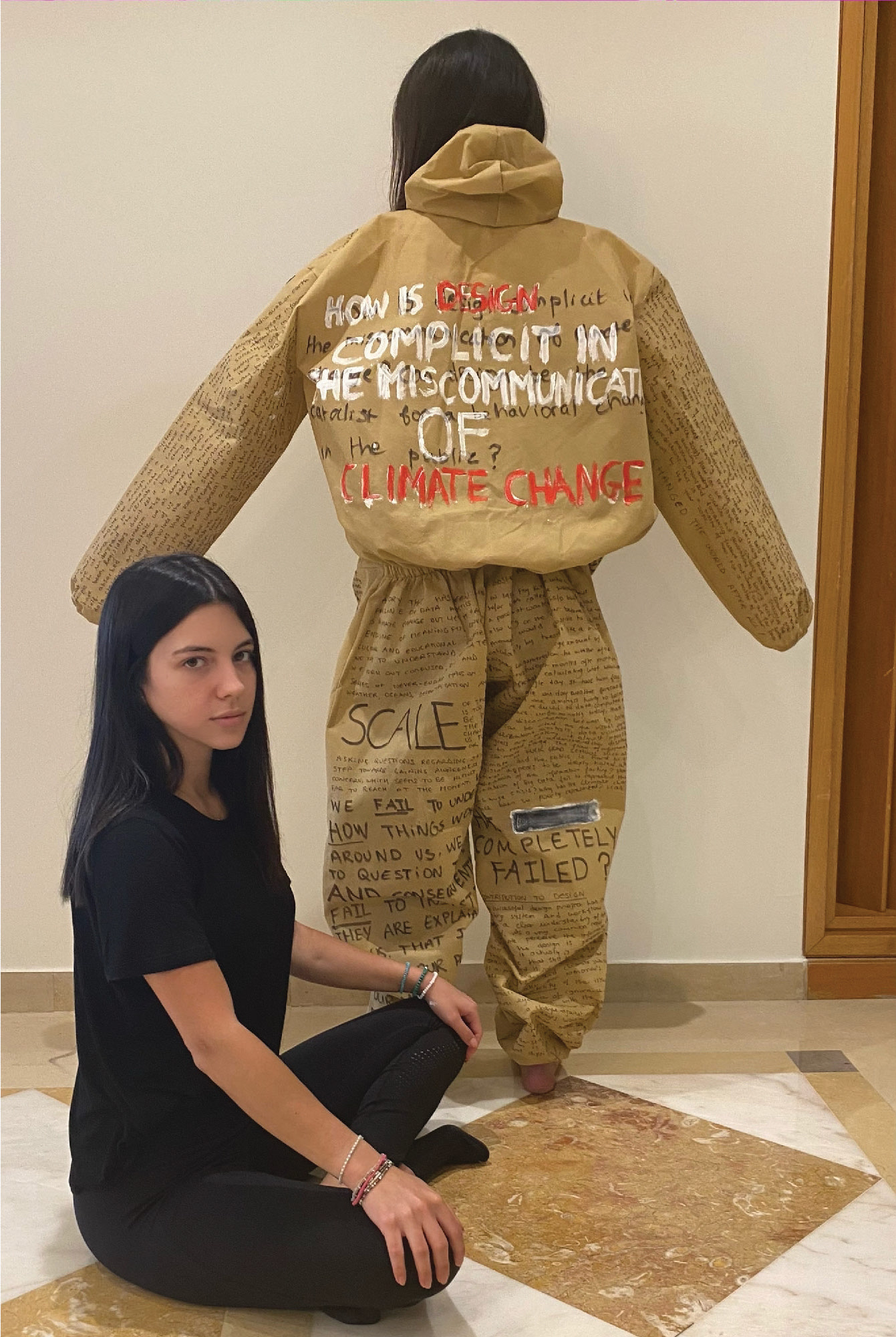
Design is in the midst of everything and this makes it my job to communicate to others what is essentially invisible to the human eye. In this case today, it is the invisible catastrophe of climate change. As a visual communicator, I created an immersive experience that narrates the story of how our apocalyptic future will look and feel like if we don’t make a change and start acting now.What is Data?
Data is not like a physical resource. It’s not already there in some way. The act of modeling data produces data. In many cases, the most interesting data is the derivative data that is produced from direct data.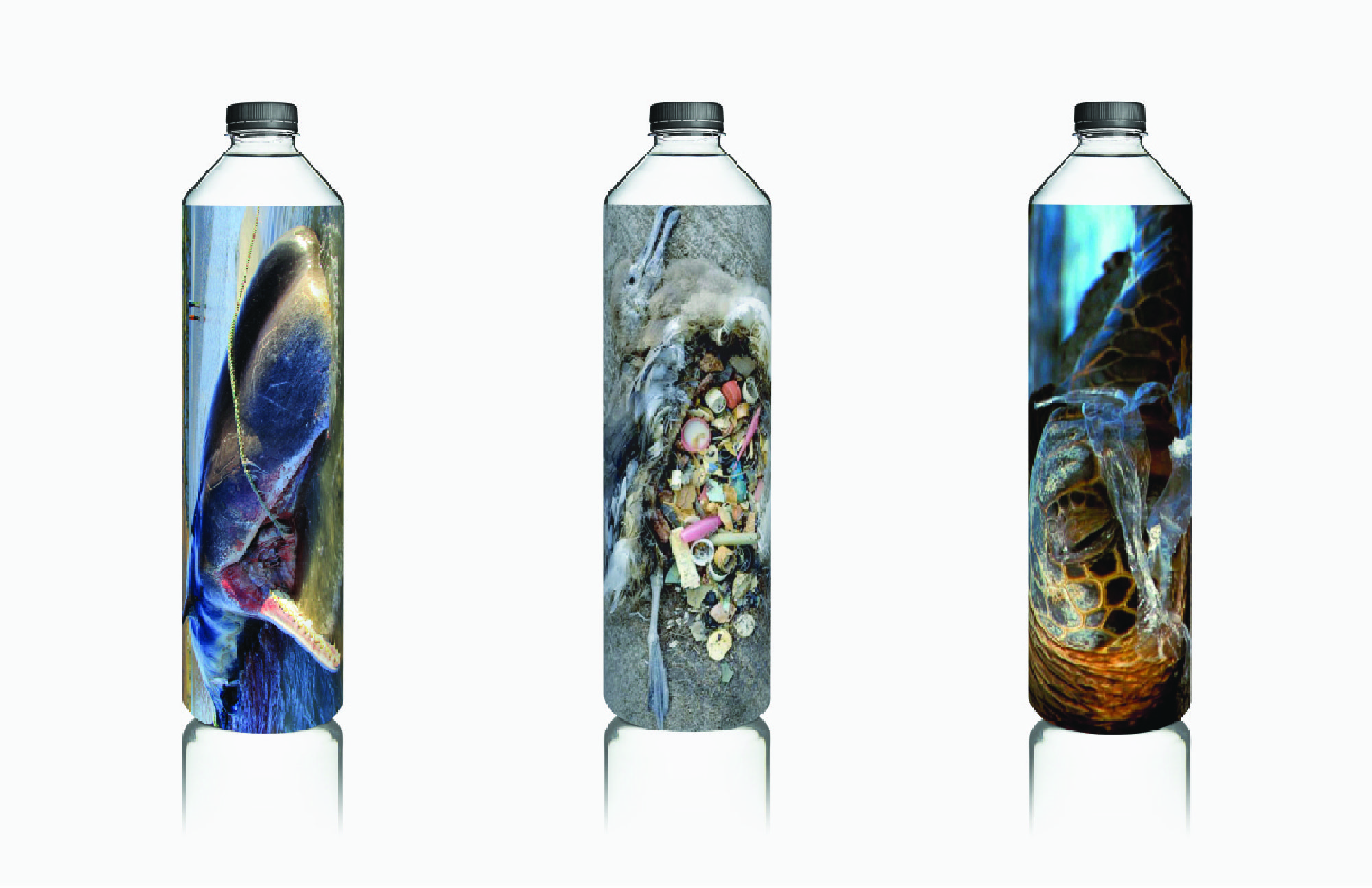
Is plastic worth dying for? Then don’t drink from *the bottle*.
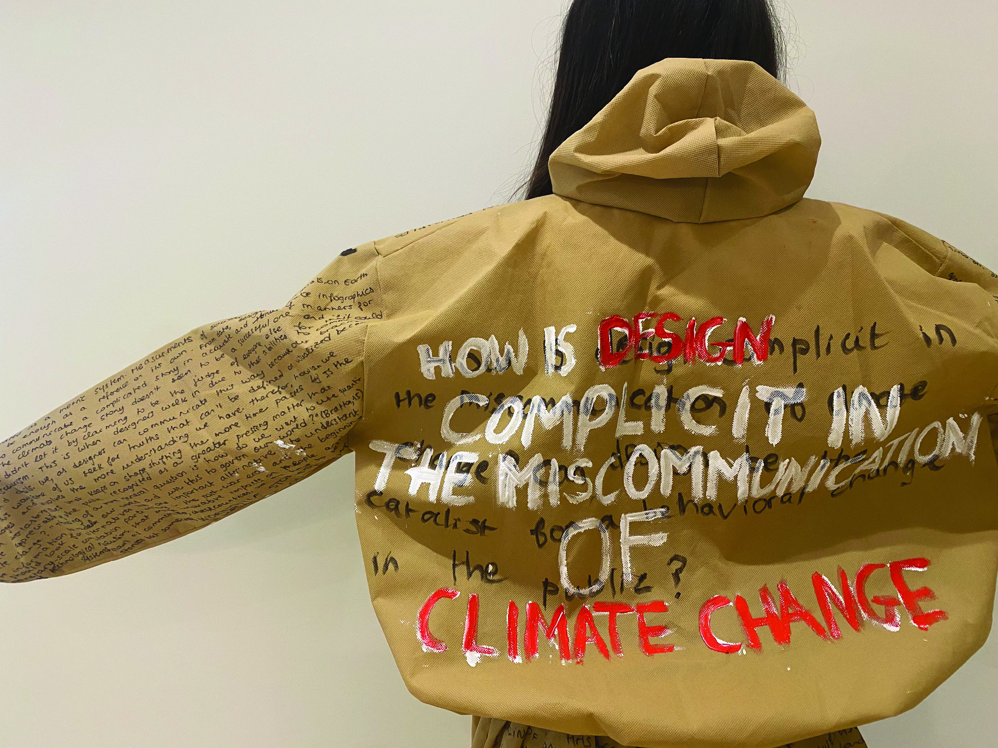
How is Design Complicit In The Miscommunication of Climate Change?

The Illusion of Trust.