Intuitive Graphic Design
Denis Afanasyev
Typographically oriented graphic design still balances itself on the comprehension of language, words, and even letters that are purely abstract shapes that don't have distinctive correspondences to the sounds that they represent. The vast majority of a type-oriented design’s success derives from the audience’s ability to decode such forms. Nonetheless, we by nature, are coders and decoders, especially when submerged within the field of communication. Subconsciously and intuitively we utilize external means that can be referred to as non-verbal forms of communication that create a greater depth of meaning. These vital but lesser-acknowledged patterns tend to stay distant from today’s mass graphic communication practices. People often open up definitions and find new ways to interpret language that is presented in the design form, but what remains constant are their individual postures, physical habits, and expressions. Graphic design keeps hiding behind the well-established system that language provides without grasping at the possibility that these intuitive, gestural, expressive, and physical communication patterns exist. As a designer who experienced the effect of needing to utilize other means of communication when language was still unknown, I am eager to engage in a space of communication where words themselves may fail to communicate. Intuitive Graphic Design proposes new methodologies that harmoniously combine materiality, type as image, physical interaction and semiotic-like visuals. The possibility to import them and strategically implement them into design will ultimately act as a better bridge for micro and macro human communications.
Capstone Book Covers
Two fully hand-made books that express the need for a more materialistic and physical implementation within mass-advertisement designs. Although the project could have consisted of any medium and format, I went with what felt like the most appropriate for the purpose of my argument and created two books that act as catalogs of posters. Although the two books contained the same content and aesthetic look, I felt I needed to push the narrative further by presenting it in two different formats. The thinking behind that regarded the diversity of application and moldability that Intuitive Graphic Design could possess on the larger scale production. The two catalogs, or books, consisted of two parts; A set of four diptychs that played with the idea of a type-driven identity juxtaposed with the methodologies of Intuitive Graphic Design. The second half focused on creating visual responses to real-life advertisements with the goal of evoking more non-verbal means of communication.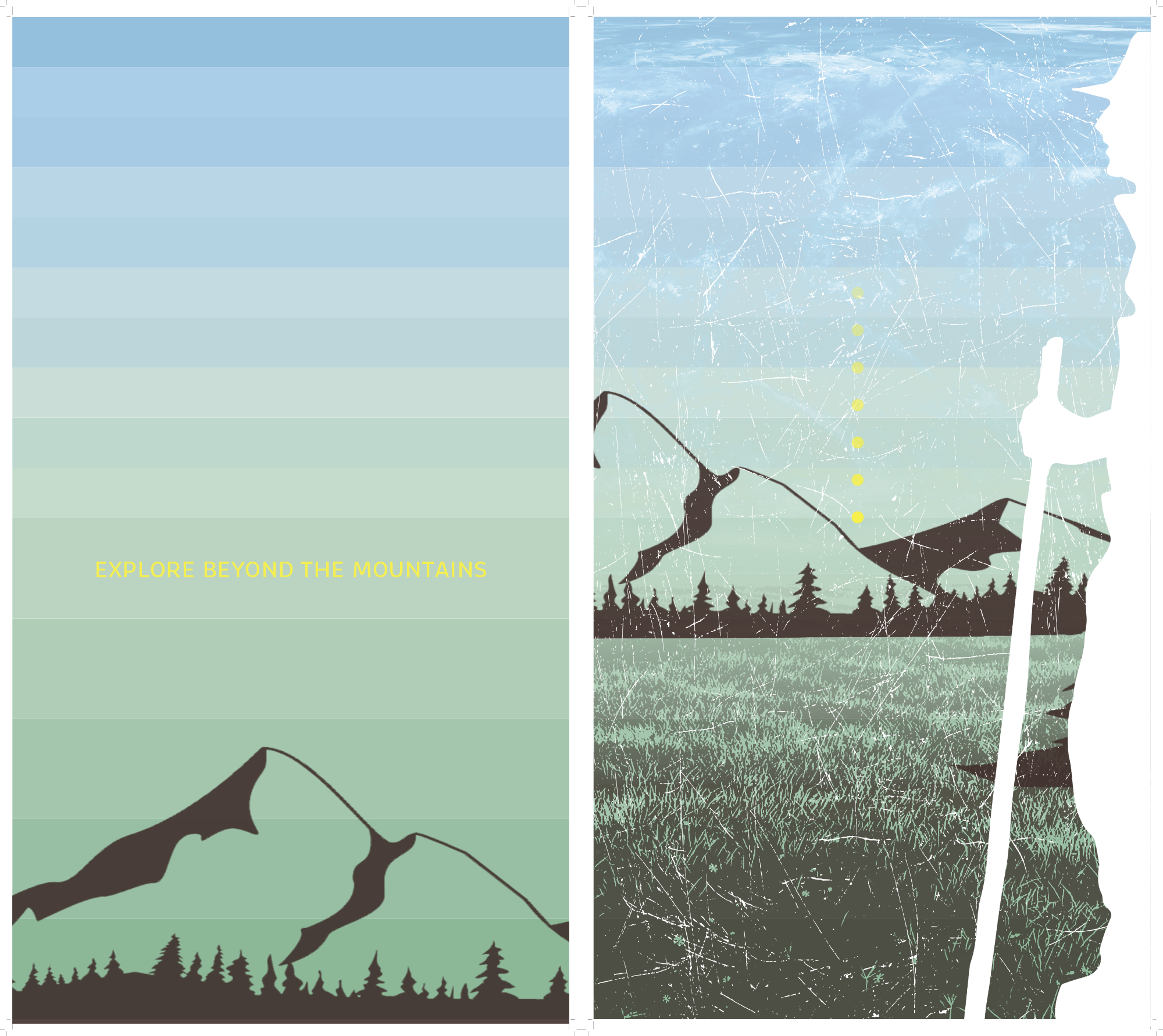
Dyptich A - Expedition
The four sets of diptychs maintain a level of visual similarity while attempting to make a comment on the importance of typography versus containing solely visual cues. The more textualized and visually advanced posters on the right confront the idea of placing an image that is controlled by type that is evident within the majority of any mass advertisements.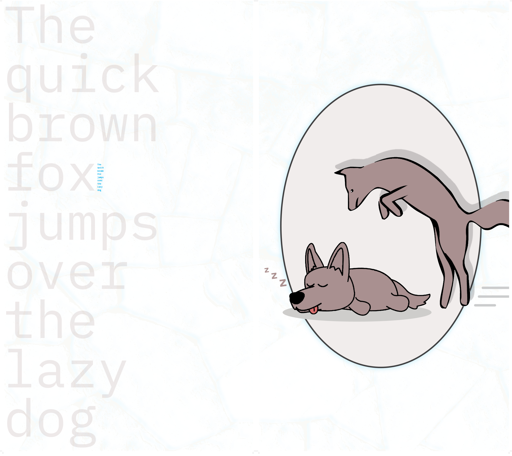
Dyptich C - Brown Fox
Dyptich C confronts the dominance of typography in a more literal manner. The phrase is known by most designers or creatives that deal with type because it visualizes a variety of possibilities that such a typeface holds. Consequently, it seemed fitting to utilize such text to comment on the efficiency of solely visual communication through a simple illustration of the text. The subtle smaller blue type adds to the commentary by making the audience spend more time studying the type rather than acquiring the message at an intuitive pace.
IGD Heineken Poster
Straying away from the original phrase “This ad is cooling your heineken” the same message is communicated through texture and symbols. Such an approach allows for the advert to be recognized as a piece of graphic design rather than a corporate message. With that kind of mindset, a more honest and a more appealing conversation can begin between the brand and its audience.
IGD H&M Poster
With the initial type saying “Go green, wear blue” through the proposed methods of IGD it was clear that texture and color can elevate the same message. A clean and simple representation holds a strong visual identity that strives to convey the message in a fast yet effective way.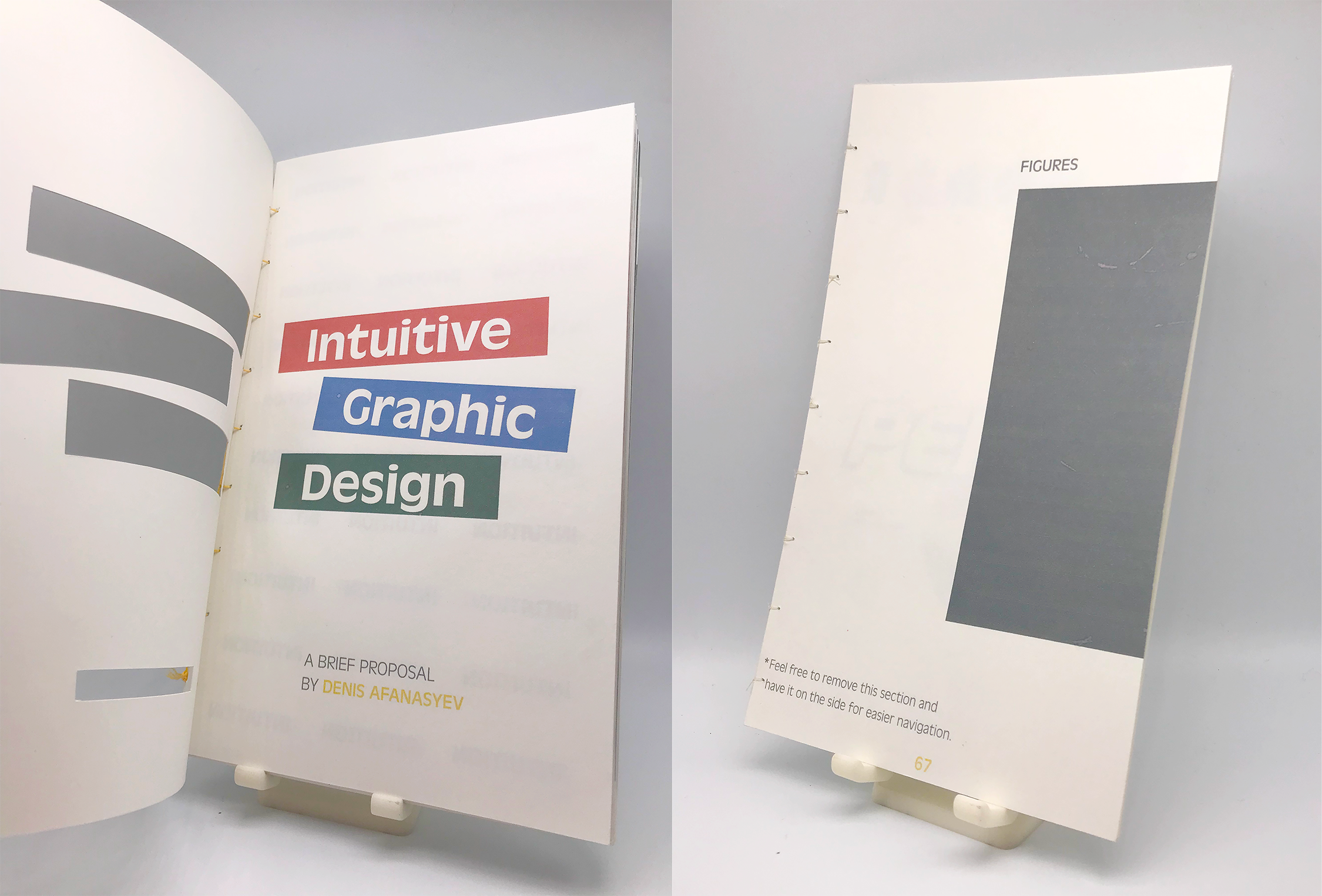
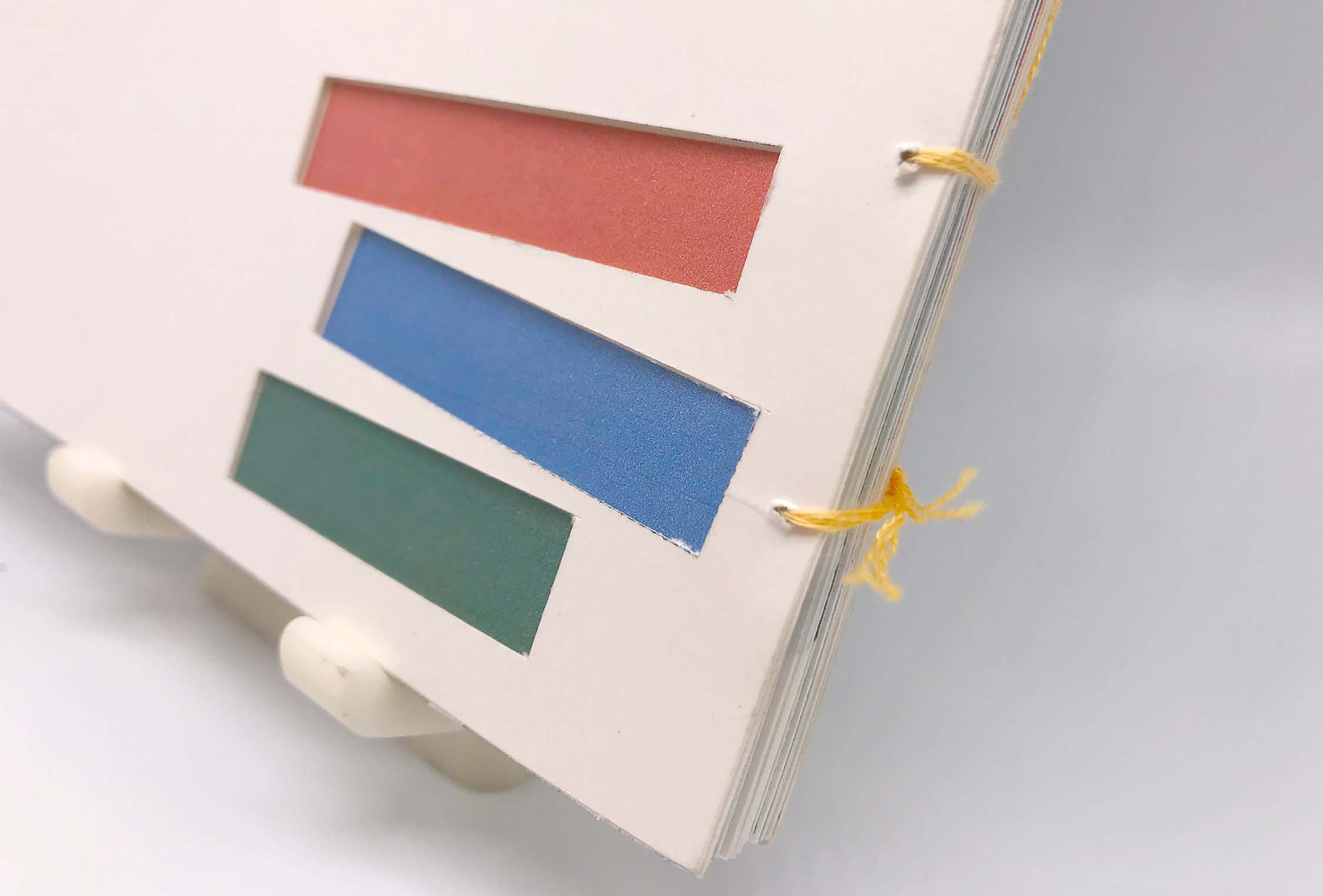
Intuitive Graphic Design Book Cover
The backbone of this book’s design attempts to present a straightforward narrative that is easy to follow and stay engaged with. The first conversation between any reader and the book is notably through the cover, which in this case is relatively simple. The added cut-out elements, angles and color choices create mystery and evoke questions that will stimulate the search for answers. What also plays a part and mostly goes unnoticed is the importance of the shape and scale of the book. In my opinion, a book that is very thick and visibly difficult to handle, even if the cover is fascinating, might discourage the passer-by to handle and flip through it. The compactness and the shape of this thesis book does not overwhelm the viewer at a first glance and encourages interaction. The manageable scale is vital for the contents to be viewed, even if it does not consist of reading every line of the body text.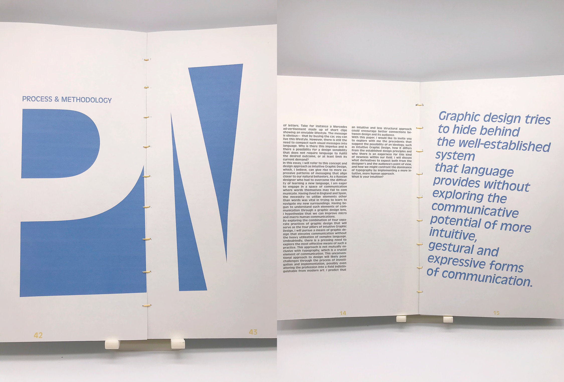
Intuitive Graphic Design Book Spread A
Hierarchy of the contents themselves needs to begin to deliver hints to the reader of what the blocks of text talk about. Enlarging certain quotes or phrases is one of the more utilized methods for this which I found effective whilst implementing such a strategy into this book. Once again, keeping the viewer engaged throughout the process and not creating an overwhelming feeling is very important to the success of communication. These larger elements of information should not give away the whole content, otherwise, the need for further inspection evaporates, and the conversation ends. Open-ended and question-provoking fragments about the narrative stimulate the next step of the reader-and-book interaction.
Intuitive Graphic Design Book Spread B
The choice behind my way of writing also goes back to the premise of this section which is to not overwhelm the reader. In my opinion, a thesis text, or any writing that is at this level of academia tends to be highly formal and strict. An authoritarian tone and articulate vocabulary convey a sophisticated narrative that deceives the reader into believing that the author is highly proficient in the subject matter and that they have to believe what they read. Furthermore, I believe that the author becomes hidden behind such a tone and the reader is in communication with the text rather than the author. Due to the argumentative nature of my proposal, it was difficult to represent it with an absolute tone, hence a more conversation-like approach felt appropriate.