Absoluteness In Graphic Design
Ruoyu Tang
Visual communication design is often obsessed with constructing fantasy worlds. Based on the visual thinking mode of modern society, the sense of reality that images can give is gradually weakened. When the designer not only wants to create a fantasy world for the audience, but also tries hard to put the audience in an inherent framework, it tells the audience directly “what I am doing”. It is difficult to say whether the quality of the design work is not satisfactory.
Designers use straightforward, mediocre, and superficial visual language and text to output the content to readers. And the audience receives directly what the designer wants to convey. But is there really only one mode, a means of communication between the designer and the audience, which is “I tell you, and you listen to me”? Designers can learn a lot from absolute music. Designers can create infinite possibilities for the audience to imagine, instead of limiting the audience’s thinking. Today, designers need to use design elements smarter, and they also need to trust their audiences to “imagine” and “feel” the beauty behind their designs.

Thesis book of Absoluteness
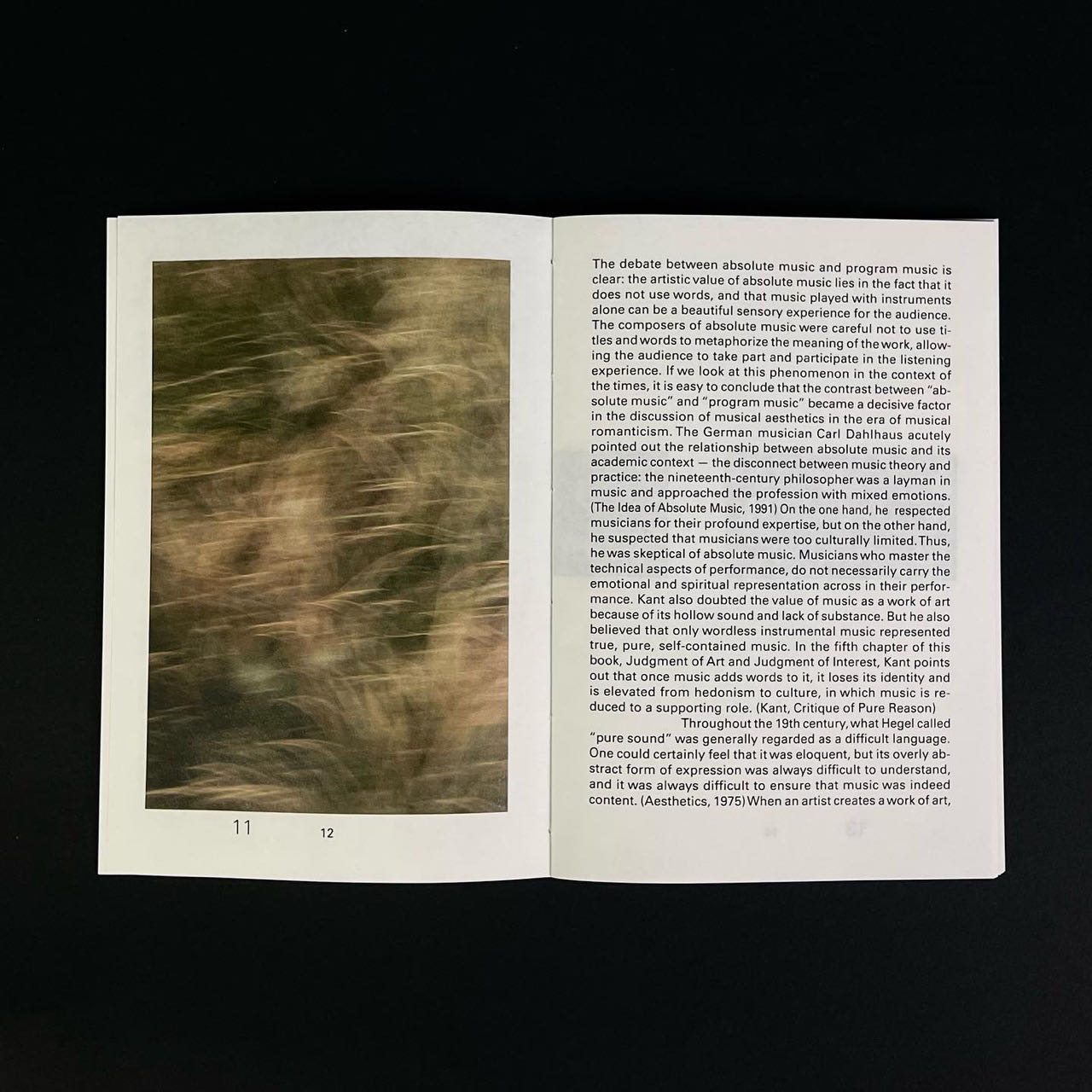
Thesis book of Absoluteness
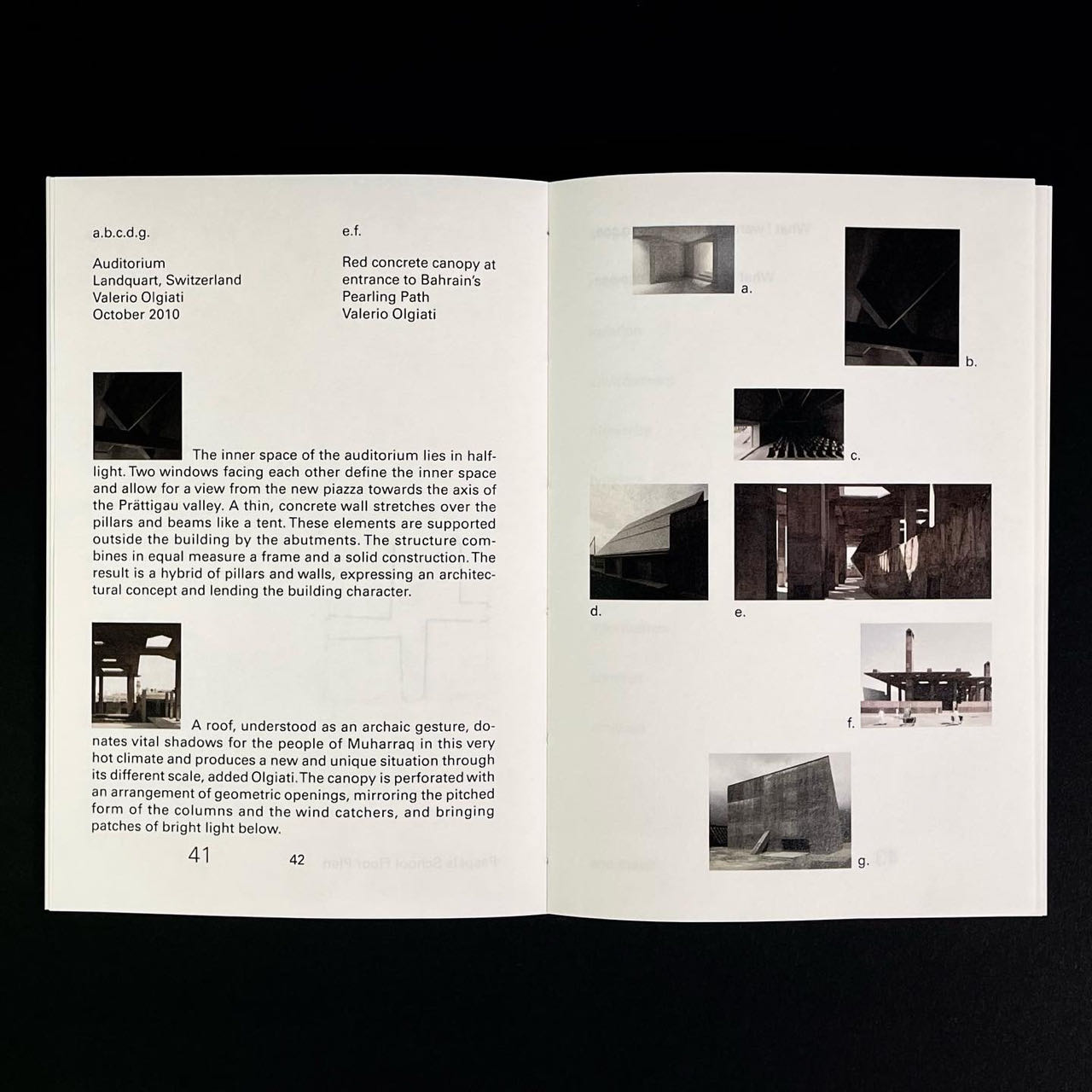
Thesis book of Absoluteness
Thesis book of Absoluteness
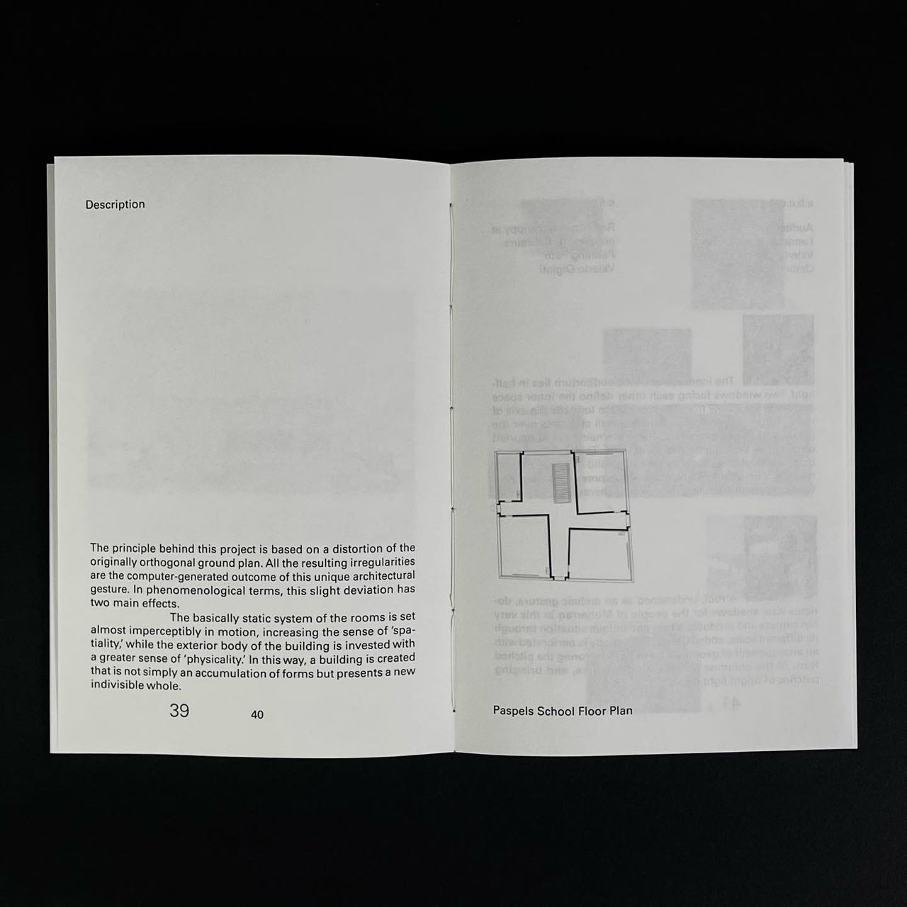
Thesis book of Absoluteness

Thesis book of Absoluteness
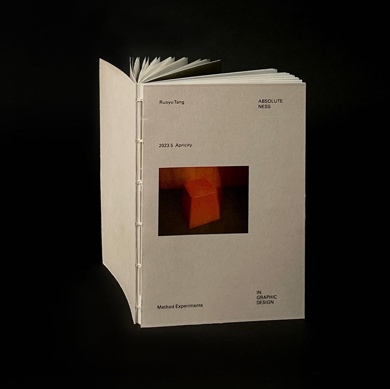
Thesis book of Absoluteness
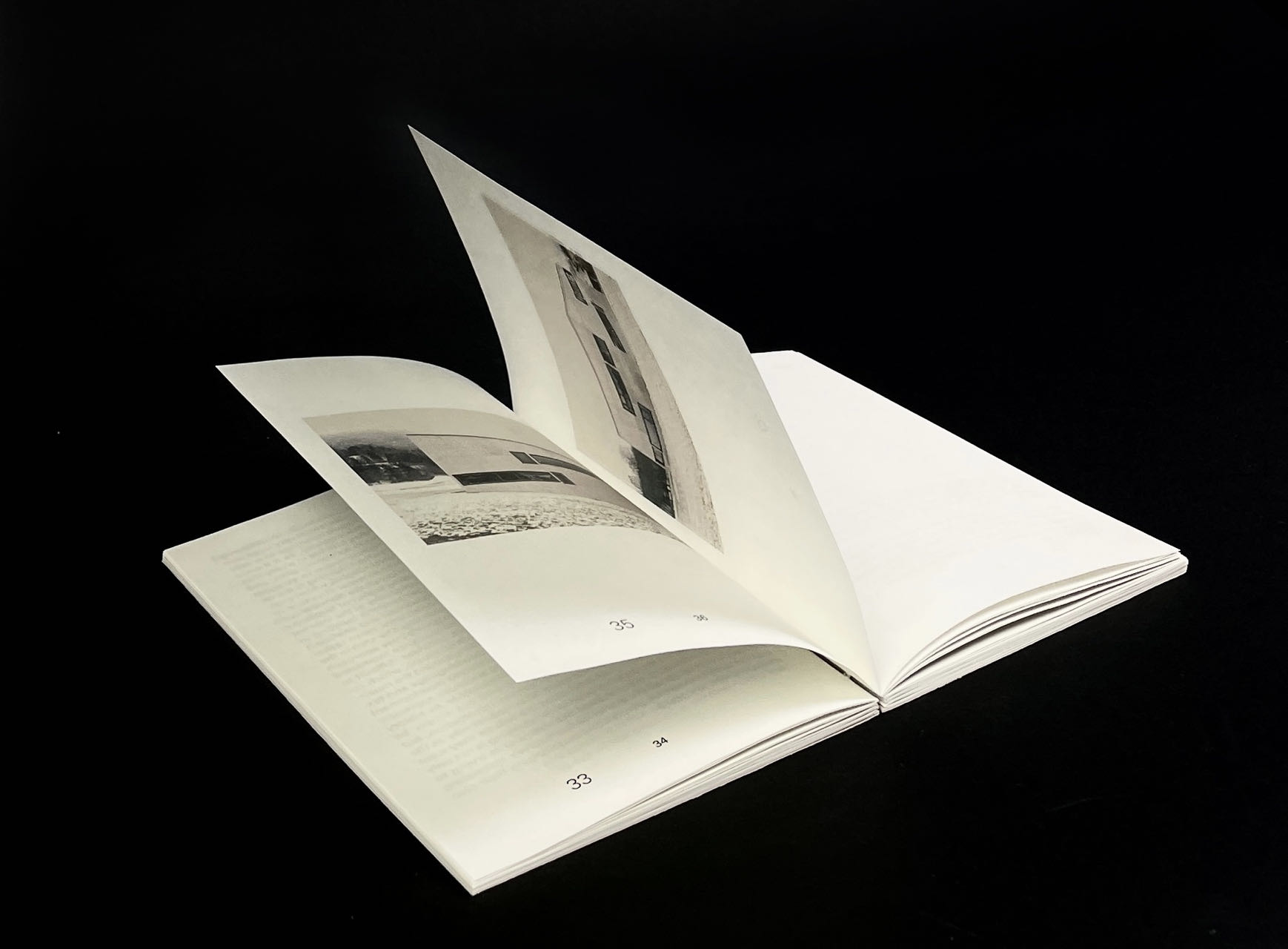
Thesis book of Absoluteness
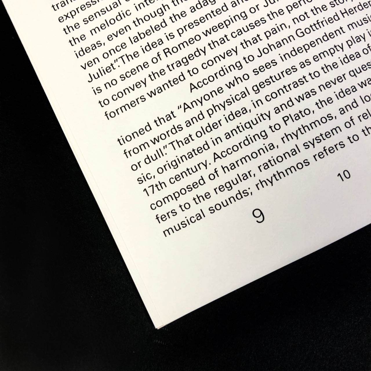
Thesis book of Absoluteness
Thesis Capstone 01
Experimental Design 1: Based on my understanding of the absolute concept, I created a simple dynamic graphic composed of lines. Because of its simple composition and without too many elements, I did not put too much emotion into it when creating it and ideas. When the audience sees it, it can give the work as many audience feelings as possible. But this is lacking. The author's as little expression as possible leads to the audience's understanding of the work being limited to the audience themselves, and the lack of interaction with the author.
Thesis Capstone 03
Experimental Design 3: In the third capstone, I added more decorative elements. It has both blurred effects and rich and varied colors, it seems to be able to express my emotions more clearly. And the feedback from the audience is also in my expectation.