The power of familiarity in design
Yiran Dai
The difference between design and art is that design should make the viewer understand the message the designer is trying to convey. Designers need to consider the use scenario and audience demographic, which will trigger the choice of style and styling semantics: aiming to bring a clear message and seamlessly connect the audience to the design. Thorough research and comprehension of the needs and perceptions of users are vital to developing any design piece. As a graphic designer, I want to use familiarity to engage the audience and convey information more effectively while avoiding boredom. At the same time, it is helpful to use design to give new meaning and value to familiar things to provide opportunities for exploration and discovery. My work will discuss the importance of familiarity in graphic design to establish meaningful and effective connections between the outcome and the audience.

More and More
Many familiar objects in the general sense of the word exist and can be part of the graphic design language. I collected 80 photos each of two familiar things, doorknobs and faucets, from different countries. Then, I extracted patterns from them. The most frequently occurring patterns were found to be the elements of the graphic design. And I used them to create posters. This project shows how familiarity can be visualized and used appropriately as a graphic design tool through collection.
Familiarity/Uamcncapcyf
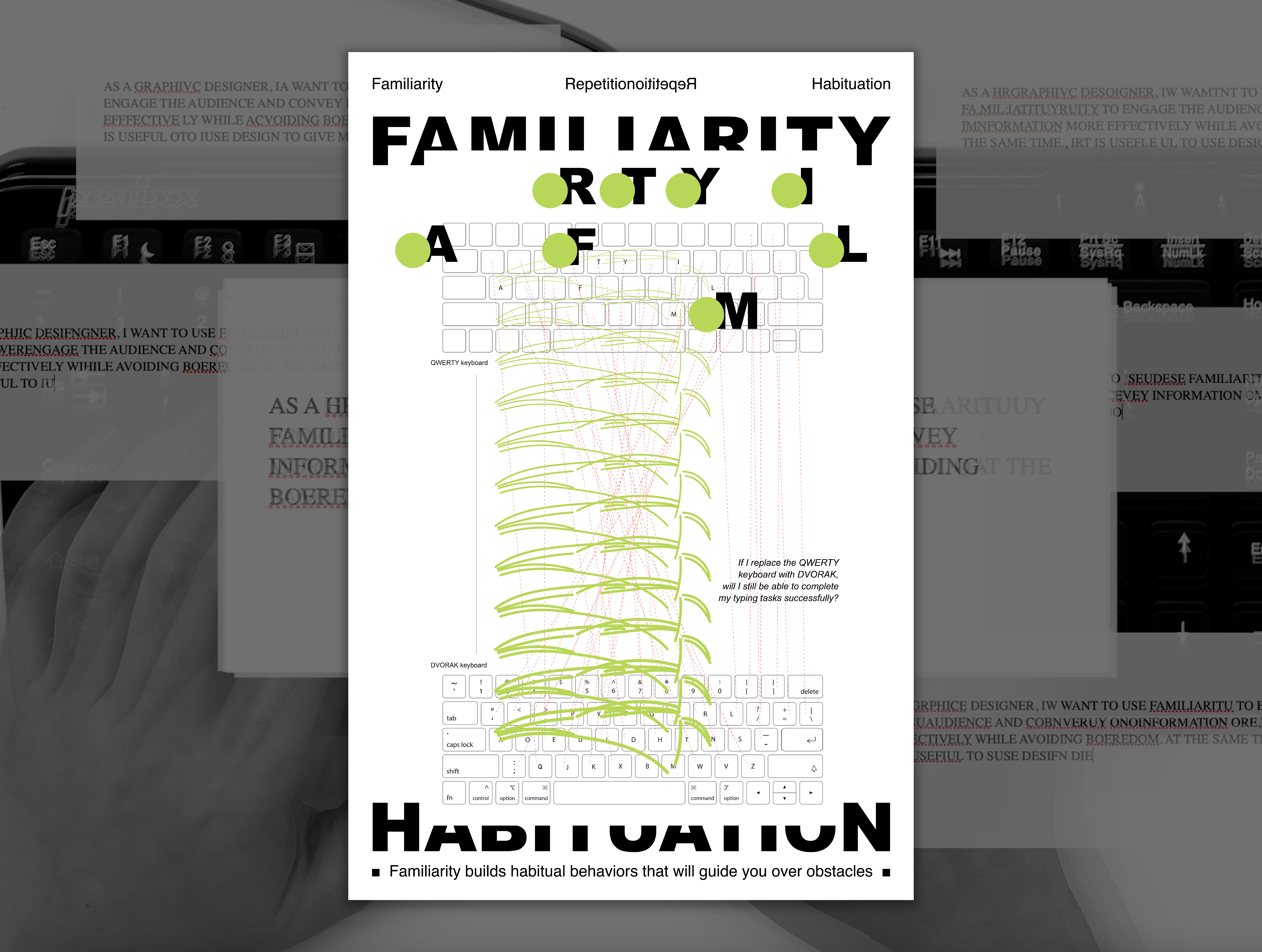
The concept of this project is to present how powerful familiar behavior can be. I used the Dvorak keyboard as the Qwerty keyboard to type the conclusion paragraph in my essay. The Dvorak keyboard is more user-friendly to laptop users due to the different layout from the Qwerty one. However, users are already familiar with using the Qwerty keyboard. I was exploring how familiar behavior could lead me to work correctly on the different working templates.Familiarity/Uamcncapcyf
I use red dots to highlight the different letters on the Dvorak keyboard from Qwerty one and green dots to highlight the same letter on both keyboards. Through the videos, the audience can experience that even though the tools have changed drastically, familiarity and the habitual behavior formed by repetitive actions can help us to cross many barriers in communication.
Same, But & Echo
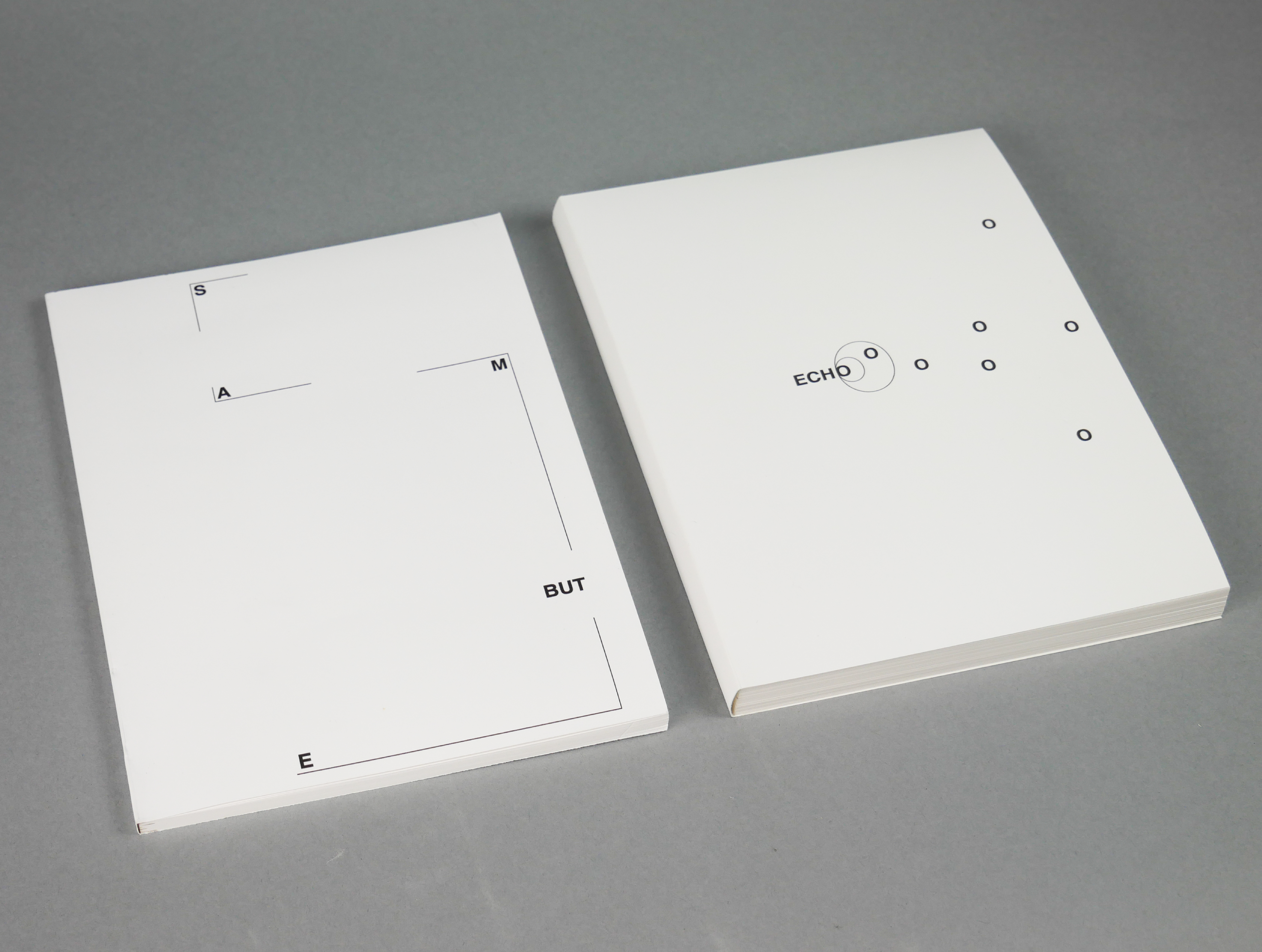
In this series of two books, Same, but is a collection of examples of how designers in different fields use familiarity in their work. Echo is a collection of photographs in which I document the visual familiarity of Chinatown, New York.
photo of Same, But & Echo

Familiarity & Design
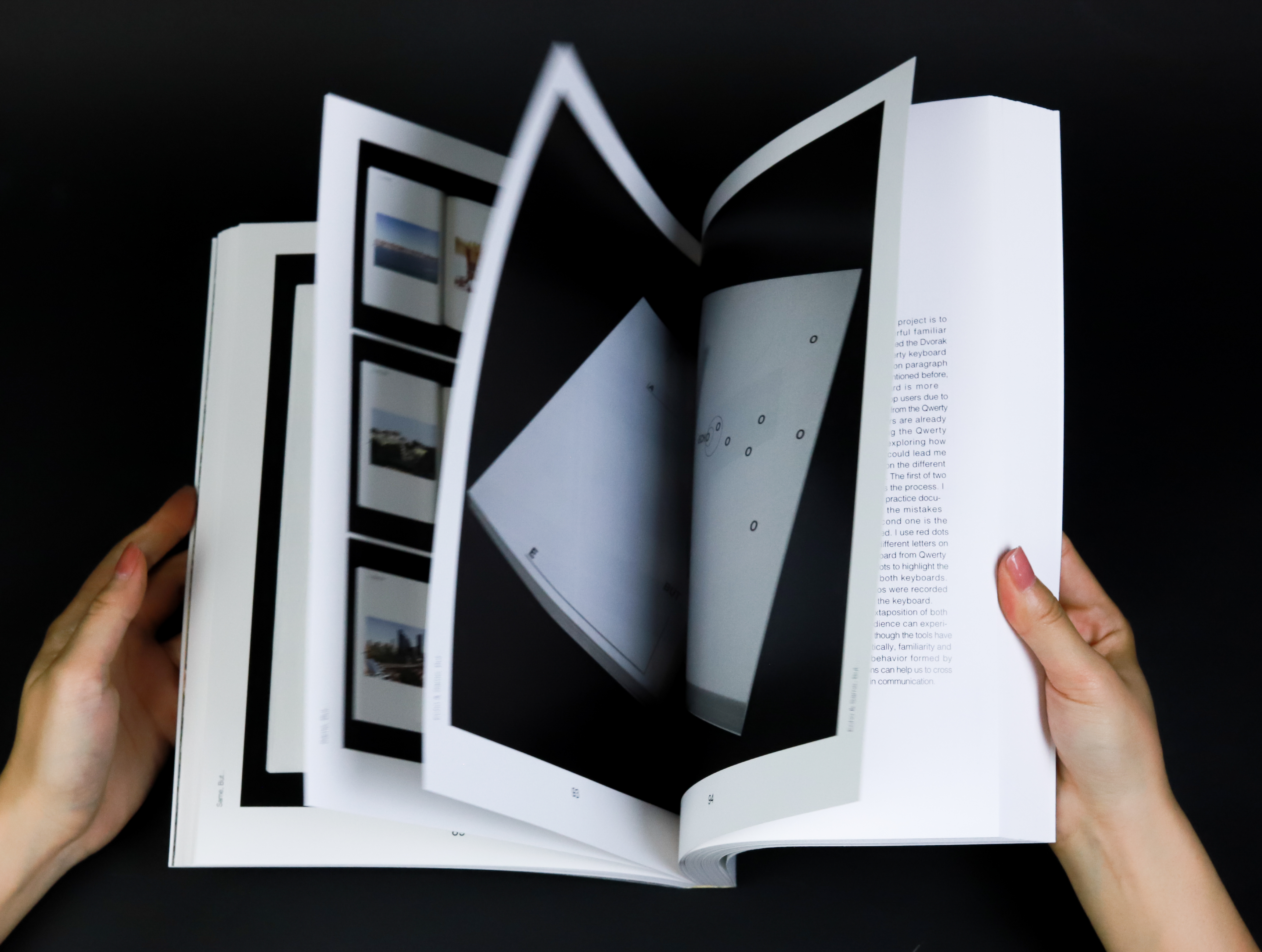
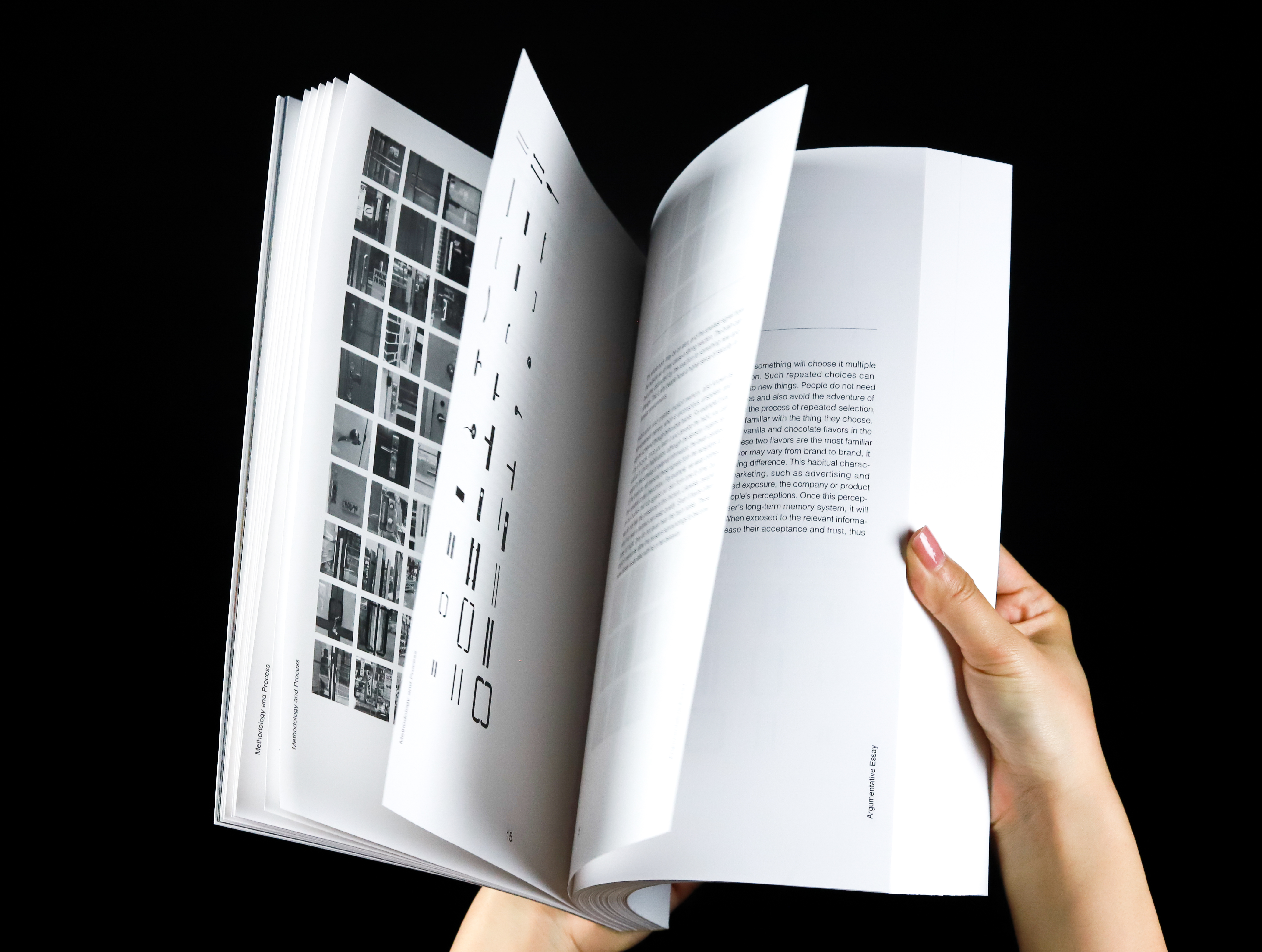
This is my thesis book. My argumentative essays and ten related projects are included in this book.
Spreads of Familiarity & Design

photo of Familiarity & Design
