Aesthetic Synchrony in Arabic-Latin Biscriptual Typesetting: Designing Counterpart Typefaces for an Efficient Relationship Between Latin and Arabic.
Shei Alshaihah
In bilingual typography, the convergence of Arabic and Latin scripts presents challenges beyond translation. This
research focuses on harmonizing these scripts, crucial for readability and communication. Visual Harmony in bilingual
typography demands understanding and innovation, driving this inquiry to provide practical guidance for designers
navigating multilingual communication.

Bilingual biscriptual typesetting is paramount in currency design, especially in non-Western cultures like the Arab
world. It goes beyond aesthetics, embodying linguistic and cultural diversity. This practice ensures that individuals,
regardless of their linguistic background, can readily access financial information and engage with their currency
My research delves into the complexities of bilingual and biscriptual realities, where English often serves as a
secondary language. This daily encounter with bilingual typography, from currency to corporate displays, underscores the
integral role of linguistic duality in shaping our visual landscape. In navigating these complexities, I conducted an
experiment in typeface design, focusing on the interaction between Arabic-script and Latin-script typefaces. This
experiment explored the challenges of converging two distinct writing systems, each with unique orthography and
aesthetic values. Documenting this experimental journey offers insights into the profound impact of bilingual typography
on visual communication, shedding light on its complexities and implications for readability and utility.
The design process delved into aesthetic principles governing both scripts, including letterforms, spacing, and visual
balance. Building upon this understanding, I innovated specific methods for developing my typeface. Detailed on the
following pages, my experimentation involved key steps representing the core of my approach. These steps are proposed as
guidelines for counterpart typeface design.

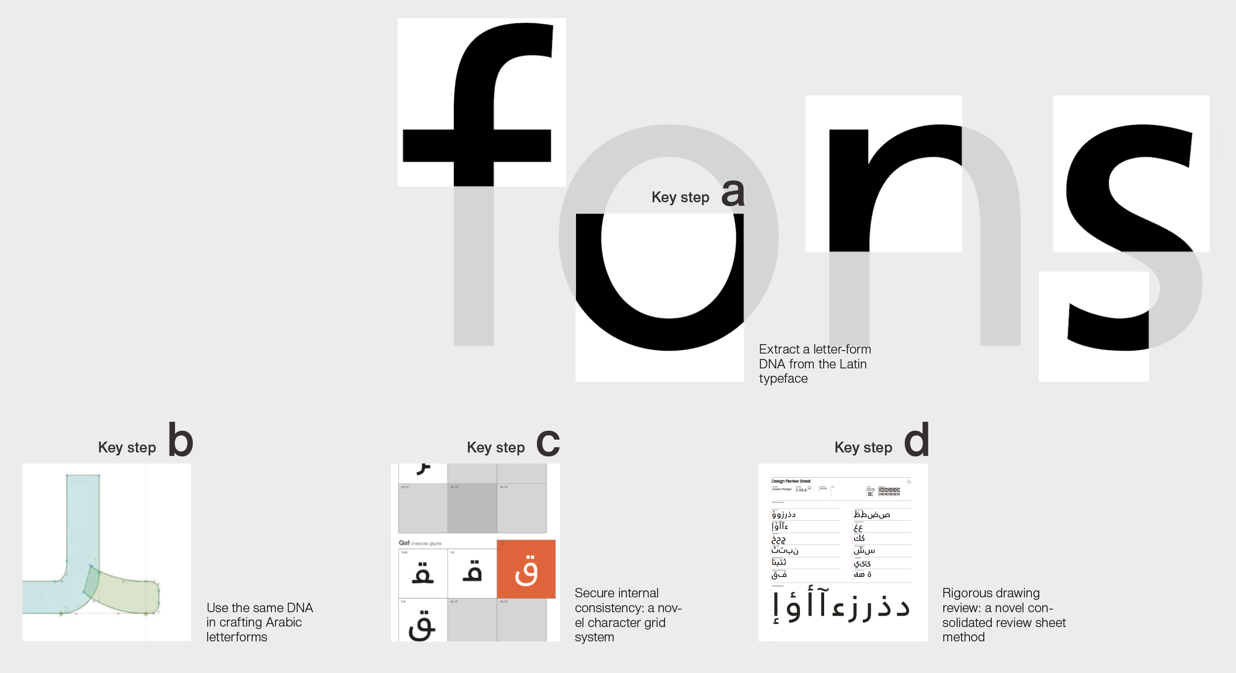
Marking: after deciding of the Frutiger typeface, I marked the distinguishing features that are essential to its drawing
style without regard to the Latin orthographic identity of a given letterform.

Extracting: isolating the marked stylistic features is crucial in making the DNA elements script-independent. A stroke
branching out of a stem in a certain stylistic manner should be seen in isolation of its application in the Latin letter
n, for example.
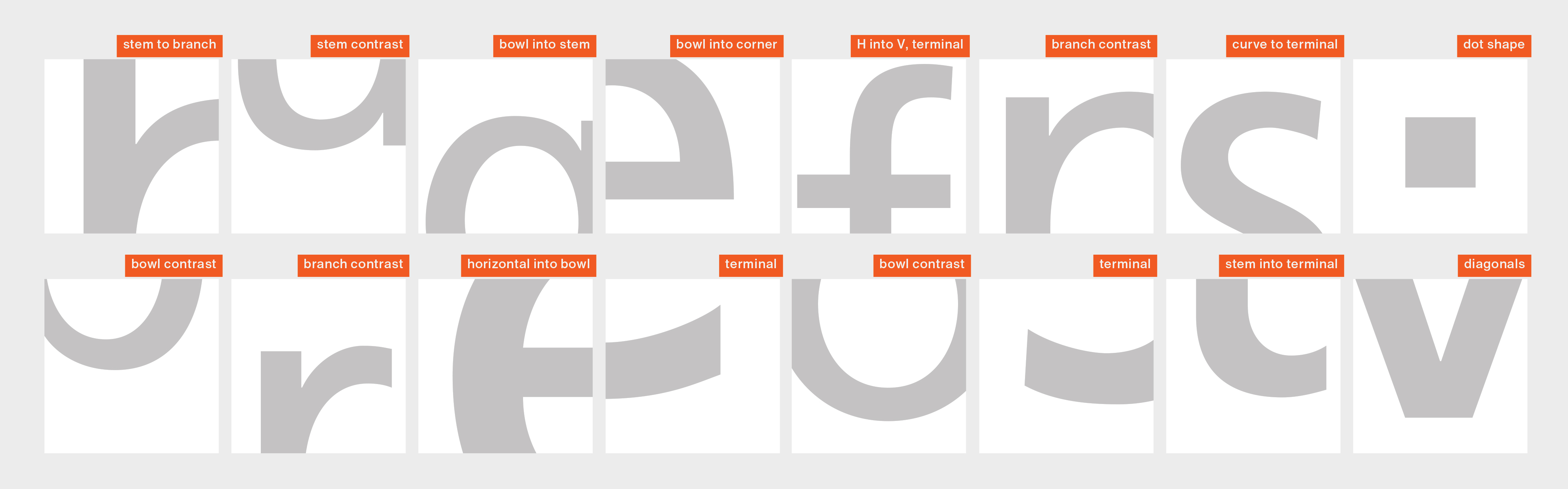
Cataloguing: finally organizing the extracted elements of Frutiger's design language. Assigning labels to cropped DNA
tiles securing their independence from Latin script letters.

This experiment applied the extracted visual DNA to create Arabic letterforms. Employing a methodical approach, it
creatively transposed stylistic features from the Latin typeface onto Arabic script details, adhering to Arabic script
norms. Moving to the drawing and reviewing phase, the experiment iteratively explored Arabic letterform interpretation.
This fusion of techniques aimed to cultivate a nuanced Arabic counterpart typeface, harmoniously pairable with the Latin
typeface in dual-language texts.
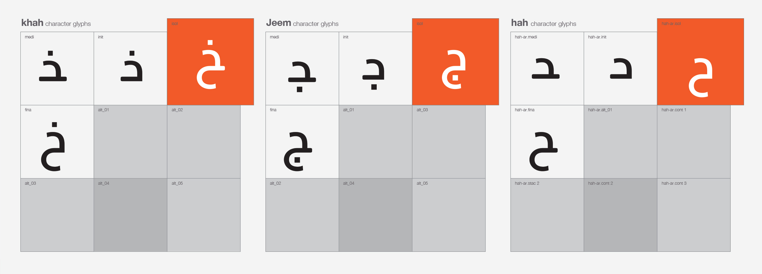
A novel character grid system: To maintain fidelity to the source typeface's DNA, I devised a grid-based system to group
character alternates. This prevented creative drift while constructing forms and curves
Crafting Arabic counterpart typefaces entails reconciling conflicting notions: maintaining the Latin typeface's
aesthetic essence while navigating Arabic script intricacies. This duality demands an original, harmonious design. To
ensure fidelity to the source typeface's DNA, I developed a system grouping alternates into a grid, preventing creative
drift. After securing consistency, I move to the review sheet process described next.