Resource Graphiky
Layan Al Huneidi
The exploration of overlooked cultural history of Arabic typography and the pressures to modernize it within contemporary design. Through research, visual experiments, and highlighting the gap in knowledge, resources, and archives. As part of this project, I created a website that serves as a living resource for Arab creatives, featuring other resources, an archive, and submissions from designers, to celebrate and preserve the richness of Arabic graphic design.
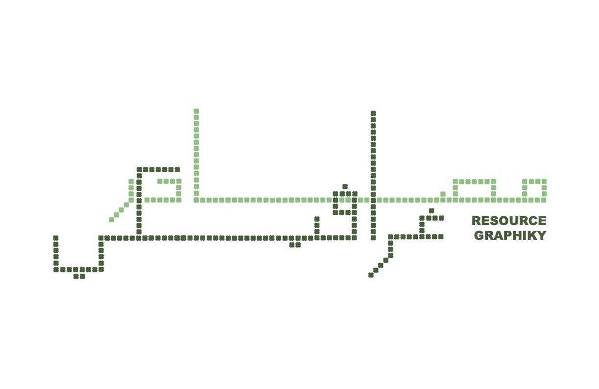
Resource Graphiky Font Layout
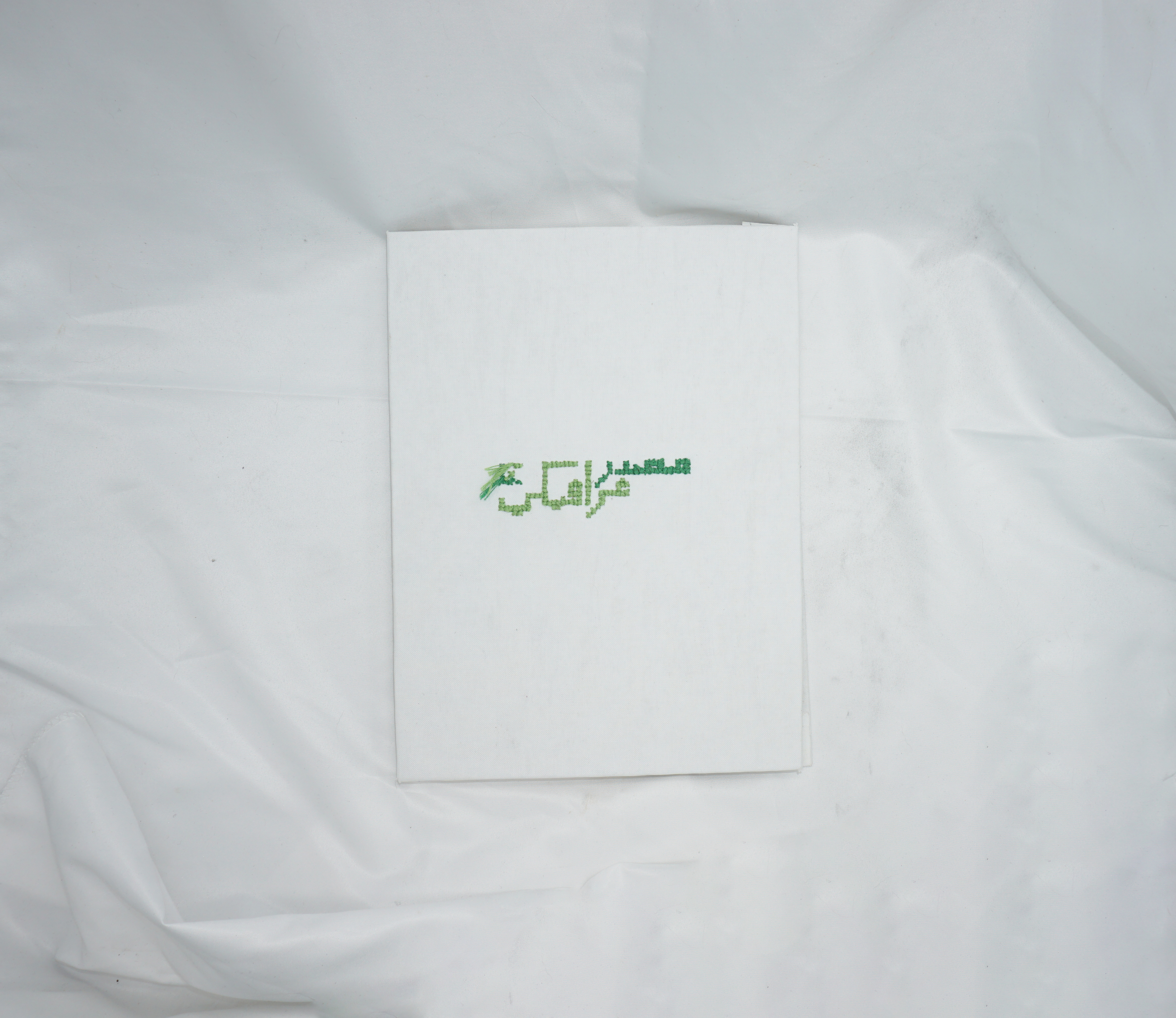
This image showcases the title of my thesis and the accompanying website, set in the Arabic typeface I designed specifically for this project. The font draws inspiration from traditional embroidery patterns found in Arab cultures, translated into a modular, cross-stitch-like structure. It serves as both a visual identity for the project and a symbolic representation of cultural preservation through type.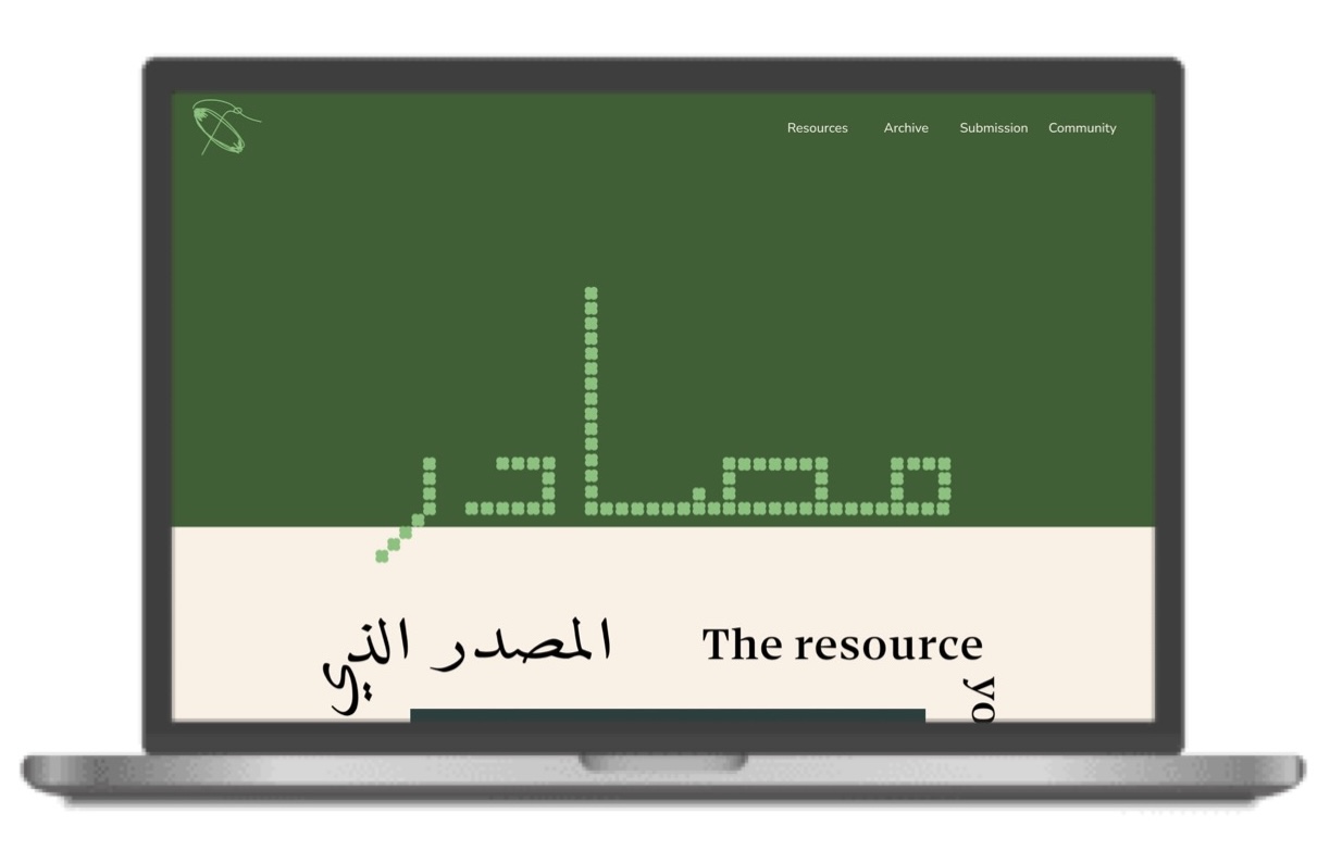
Resource Graphiky Website, Home Page
This is a screenshot of the homepage of the Resource Graphiky website—a digital hub I built to serve Arab creatives. The site functions as an archive and resource center, housing Arabic typefaces, graphic design references, and user-submitted works. It was designed with accessibility and community-building in mind, responding to the lack of centralized Arabic design archives.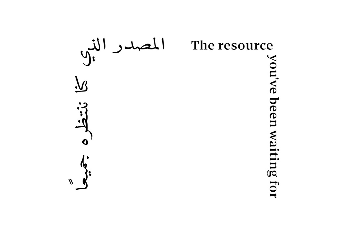
The Resource You’ve Been Waiting For
This is a typographic design piece created for the website. It plays with the phrase “The Resource You’ve Been Waiting For,” visually emphasizing the sense of urgency and long-overdue recognition of Arabic design resources.
Embroidery Pattern
This image shows a geometric embroidery pattern created for one of the proposed book cover designs. The pattern references motifs commonly found in traditional Arab textiles and serves as a visual bridge between the tactile heritage of embroidery and its reinterpretation in digital graphic design.
Resource Graphiky Lettering
This is a hand-rendered Arabic lettering piece created for my panel in the Pratt exhibition. It spells out the project title and was designed to visually echo the embroidered and hand-made qualities of the custom typeface. The lettering reinforces the thesis’s central themes of identity, craft, and cultural specificity.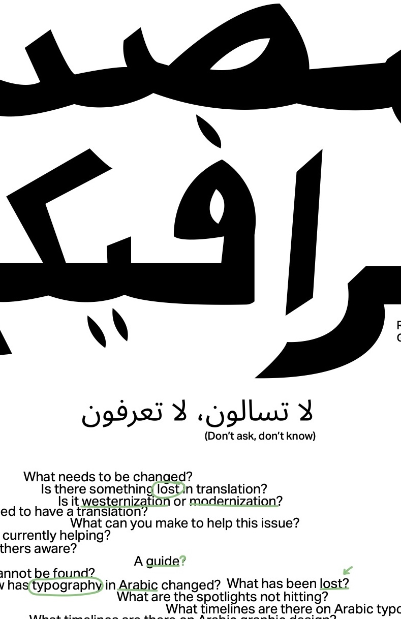
Questioning Poster, Closer Look
A detailed view of my exhibition panel at Pratt, this section focuses on annotations and questions that guided my thesis process. Here, the viewer can see how handwritten notes and visual language intersect to document an ongoing dialogue with the self, Arabic typography, and cultural memory.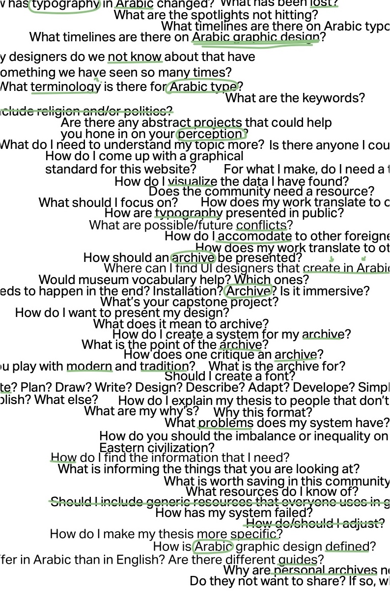
Questioning Poster, Closer Look
Another close-up of the exhibition panel, showing additional text, sketches, and design experiments. This view emphasizes the layered and iterative nature of the thesis development, making visible the internal process of questioning, reframing, and refining my design practice.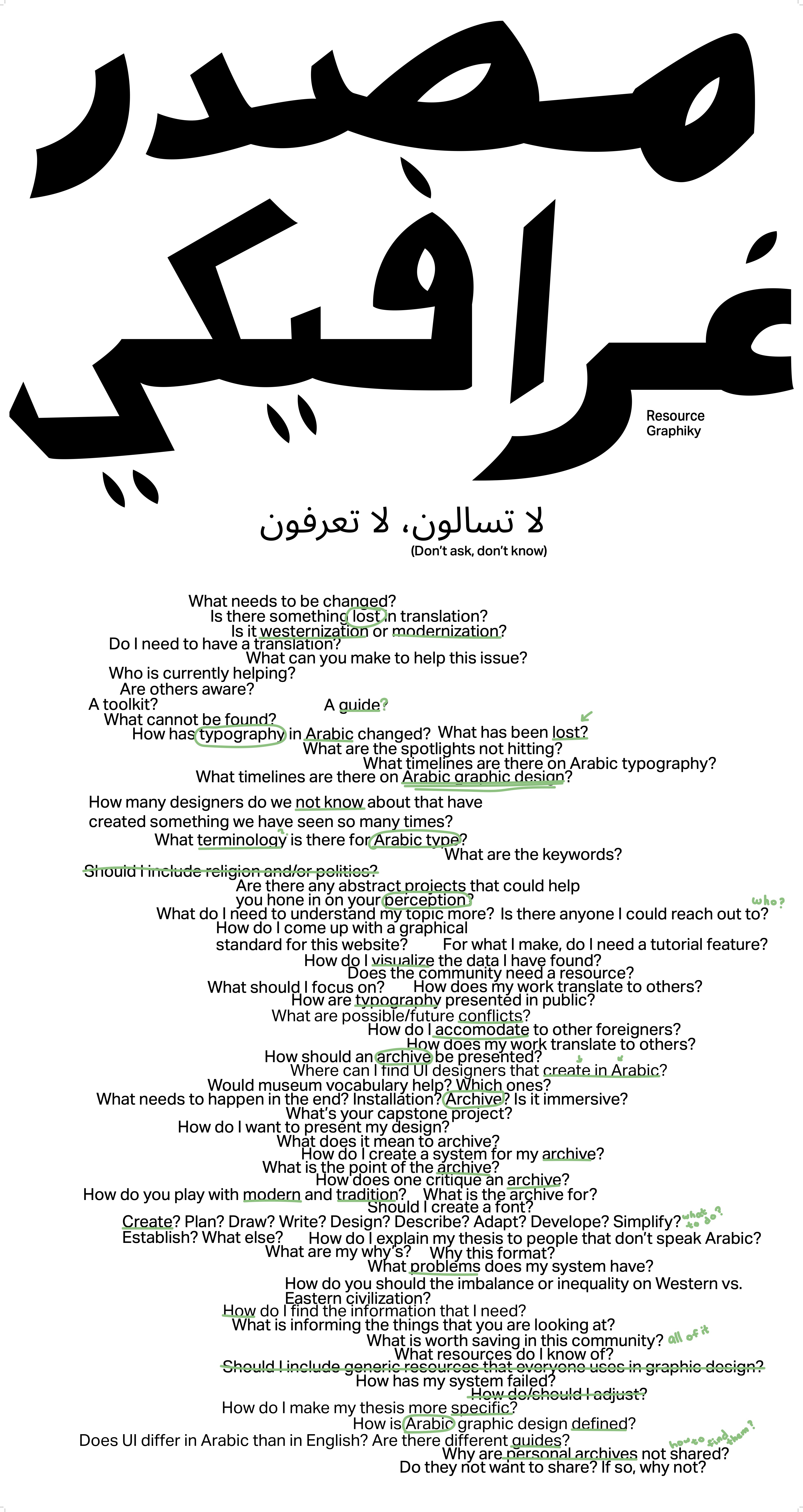
Questioning Poster
This is the full panel exhibited at Pratt, titled Questioning. It features the Arabic lettering I created, questions I posed to myself throughout the thesis journey, and annotations that dissect my thought process. The poster operates as a visual journal, part design artifact, part reflective essay.
Don’t Wait Embroidery Motion Graphic
An animated motion graphic that uses the custom font I created. The animation begins with scattered cross-stitch, “x” marks, that slowly move in unison and eventually form the words “Don’t Wait.” This piece is a call to action for Arab designers to take initiative in shaping their own narratives.