Integrating Illustrative Flair in Clinical Cosmetics
Eun Gyeong Lee
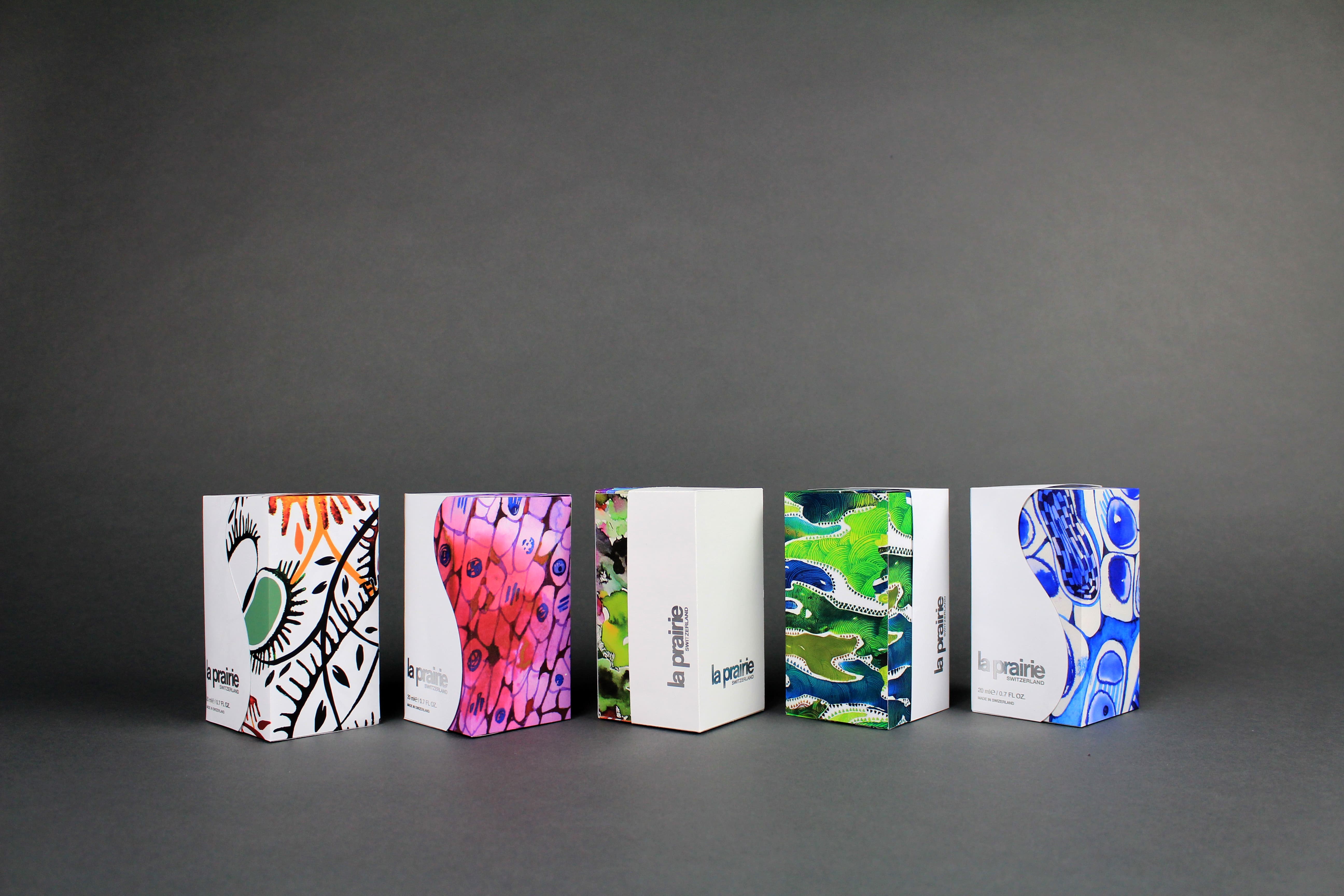
Many consumers prefer clinical skincare packaging, but this approach has a limited visual appeal. This thesis proposes that a balance between clinical packaging and integrated illustration can improve visual appeal while maintaining the consumer’s trust. The proof of concept explores transforming a high-end skincare brand that is traditionally very clinical in appearance. The goal is to maintain luxury and elegance while repositioning the product through a striking design approach.
This video shows the motion of pulling the primary packaging out of secondary packaging.
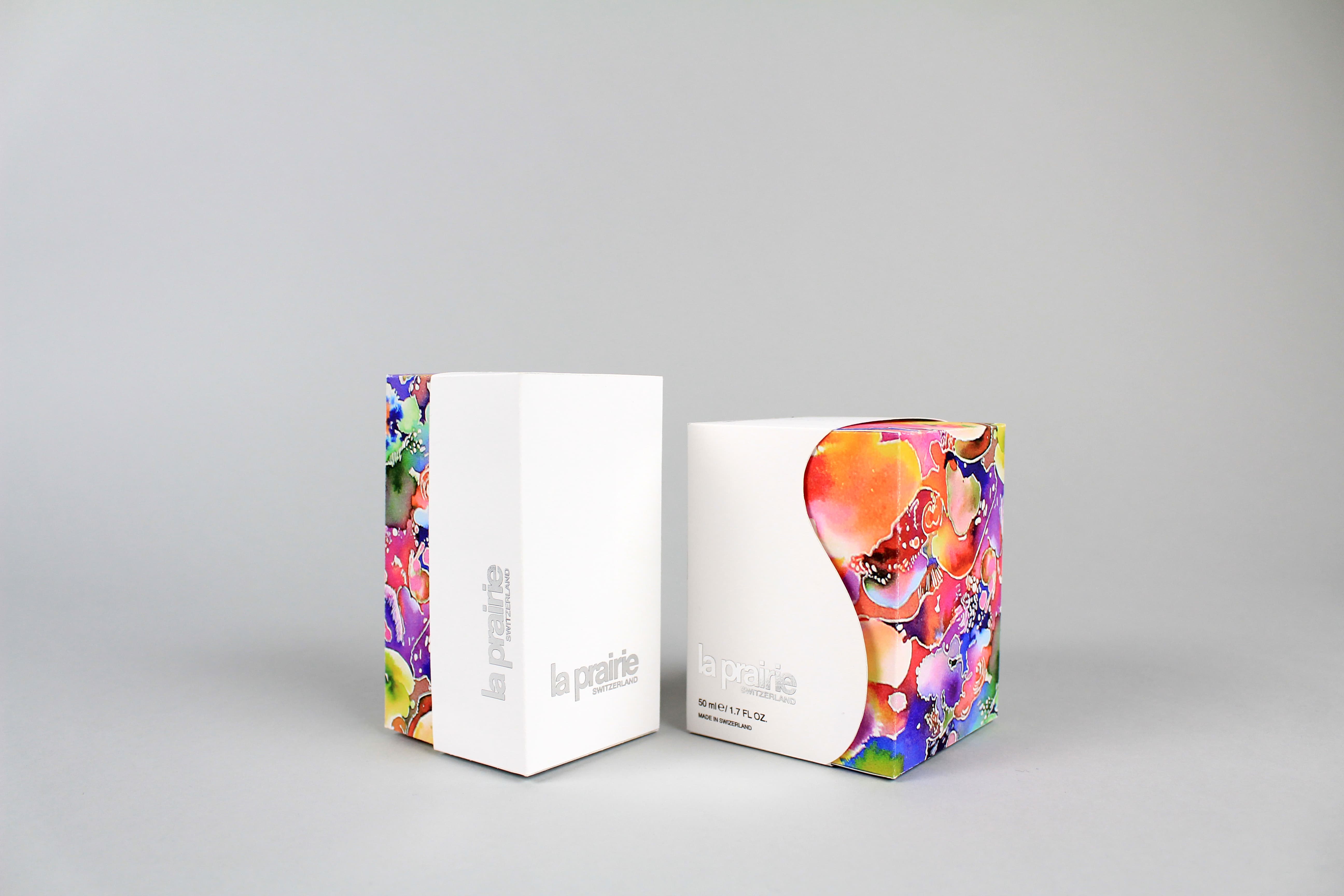
This image compares front part and back part of the secondary packaging. (Right - front, Left-back) Front part of the design has a nice and smooth curve when back part has a straight cut which conveys mutual feeling.
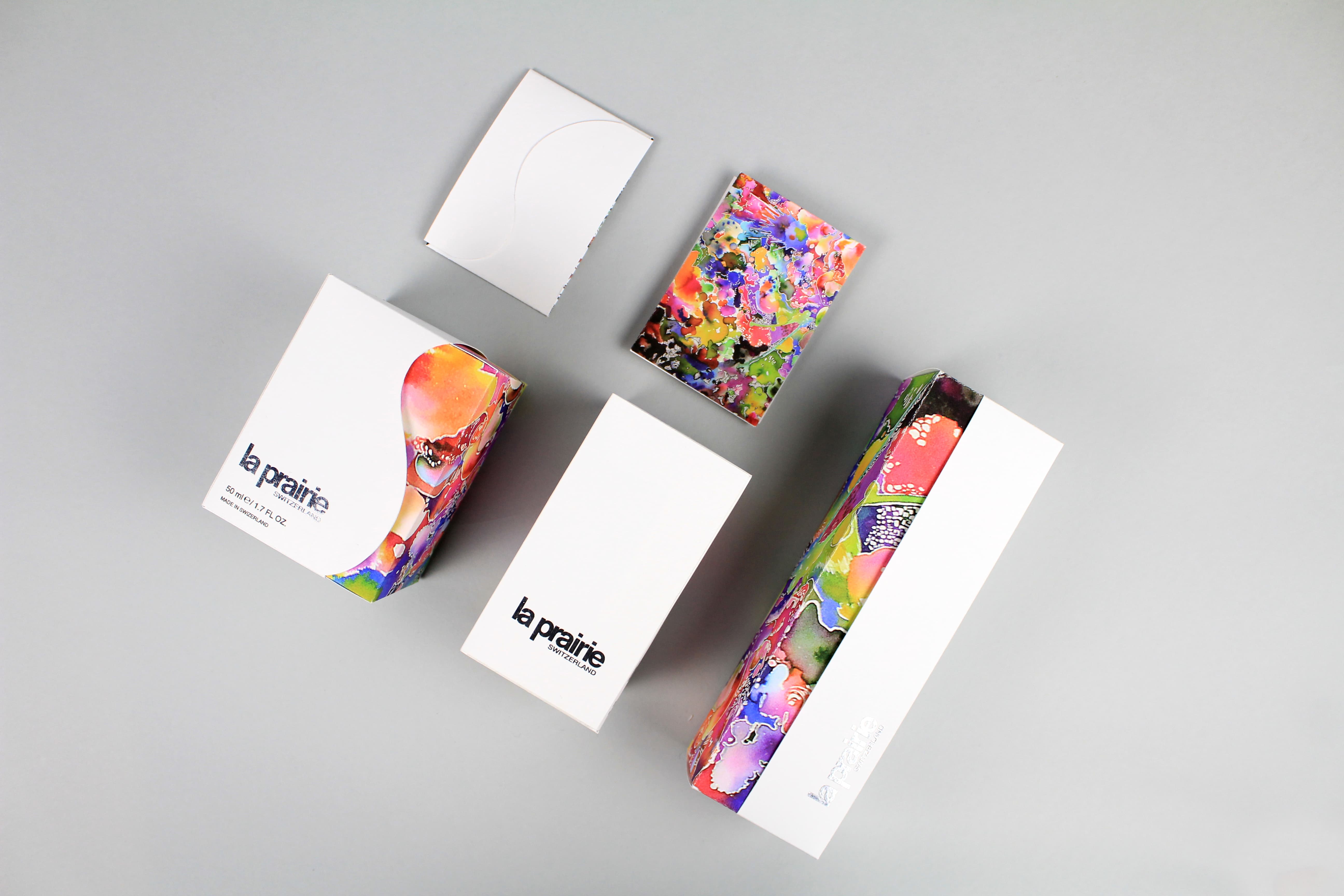
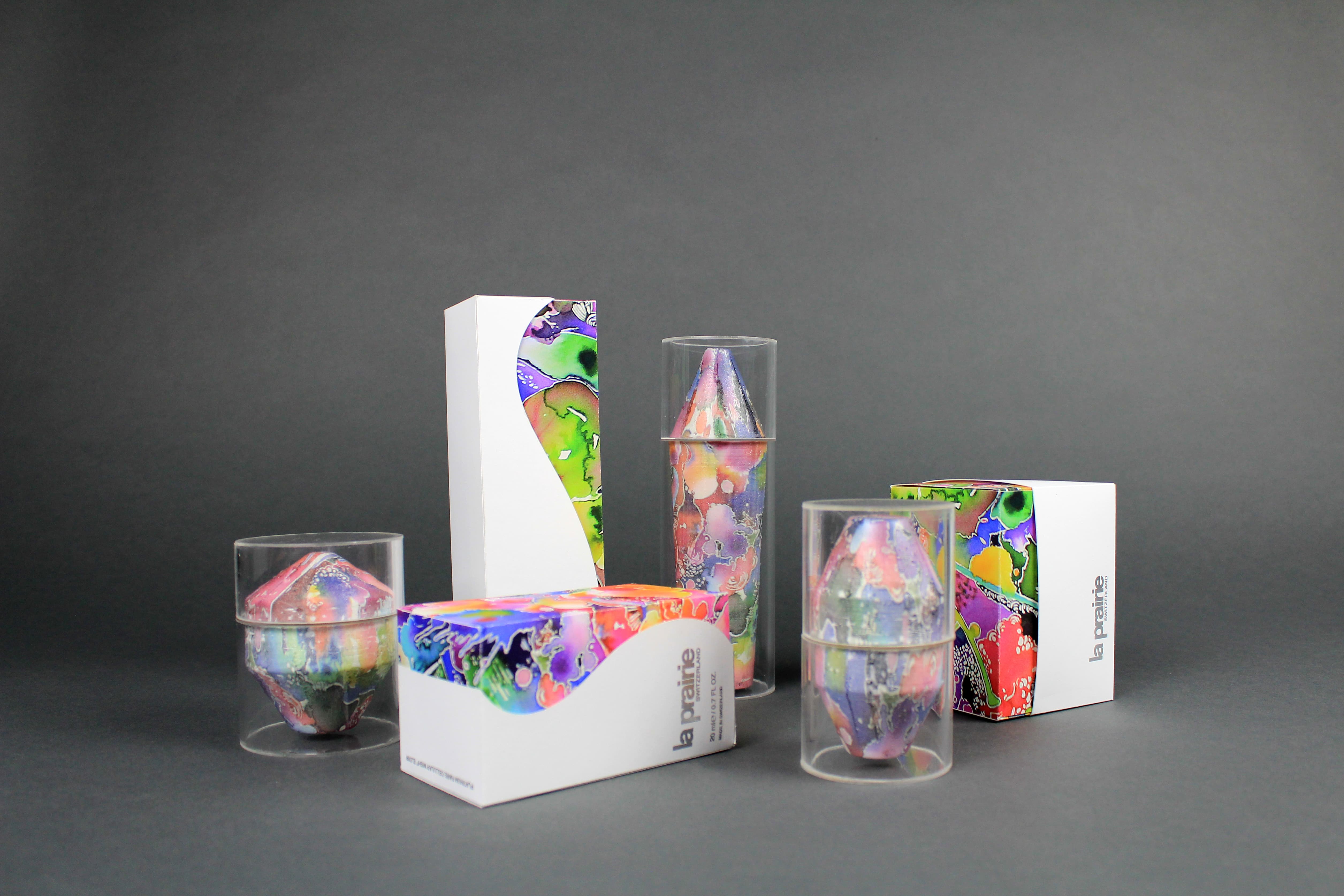
Full shot of the 3D models and box packagings.
These envelopes designs are for the promotional cards, business cards, advertisement, etc.
This shows different sides of the secondary packaging (front,side,and back)
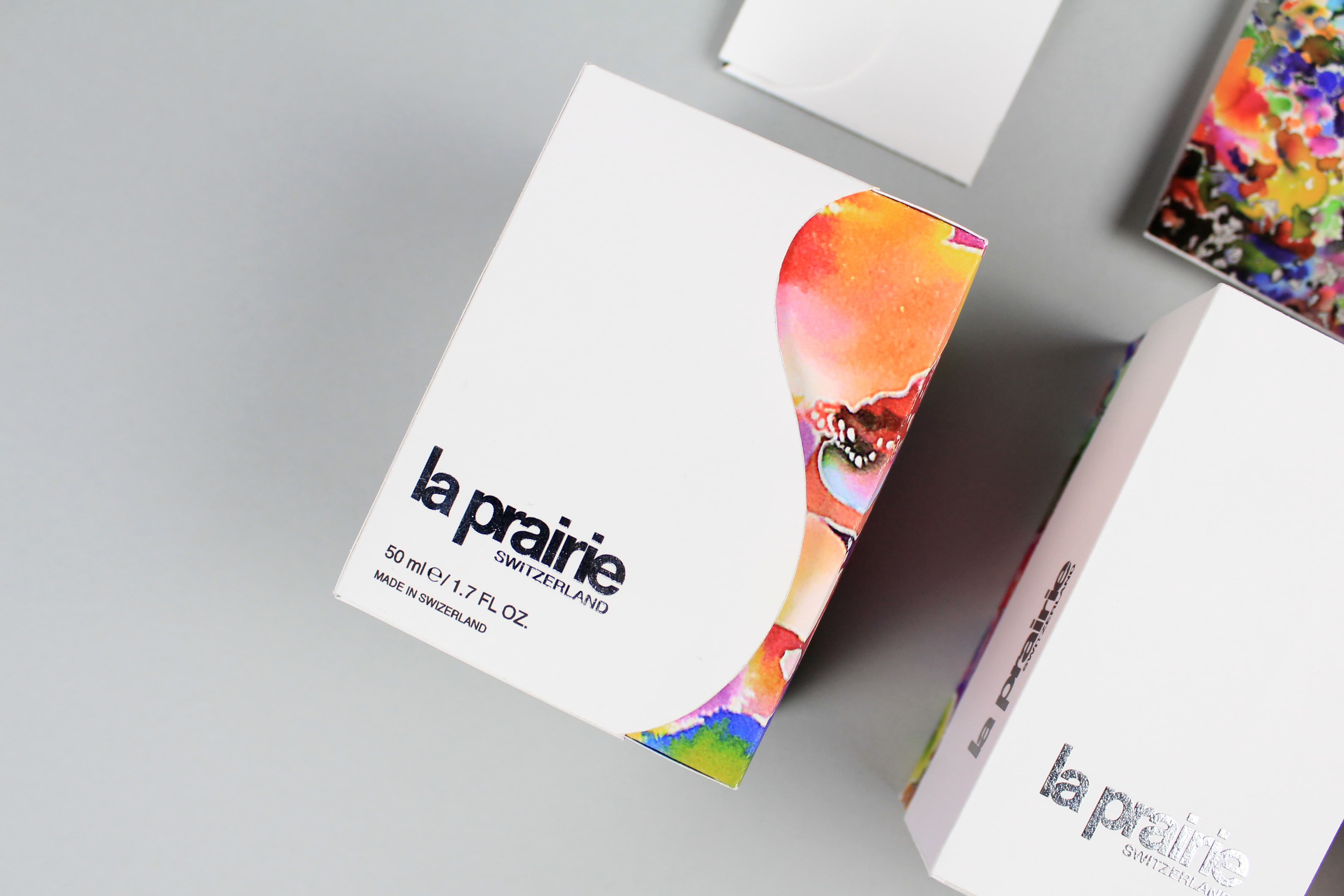
Close-up shot of a packaging to capture the detail of the silver foil.
This shows different sides of the secondary packaging (front,side,and back)
Full shot of the 3D models and box packagings.
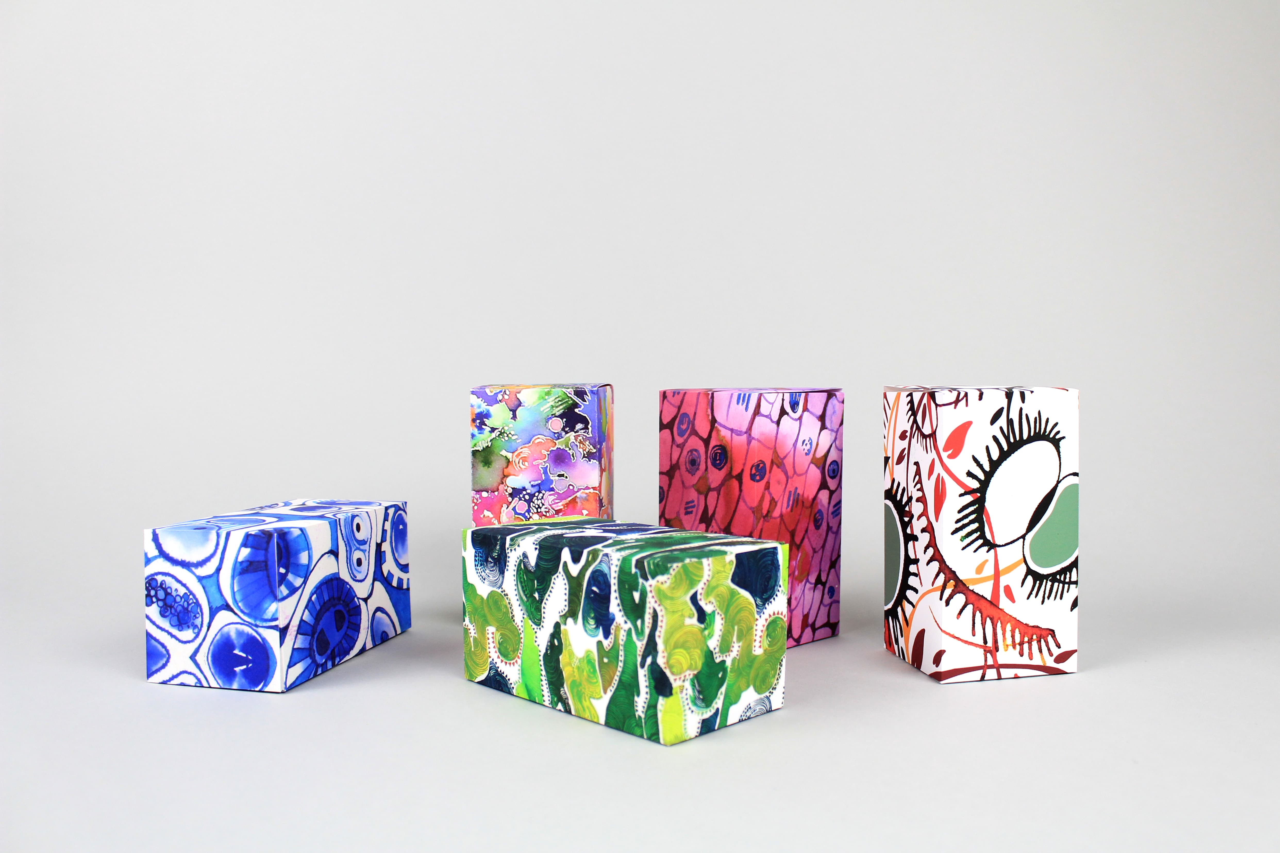
More illustrated packaging for other collections.
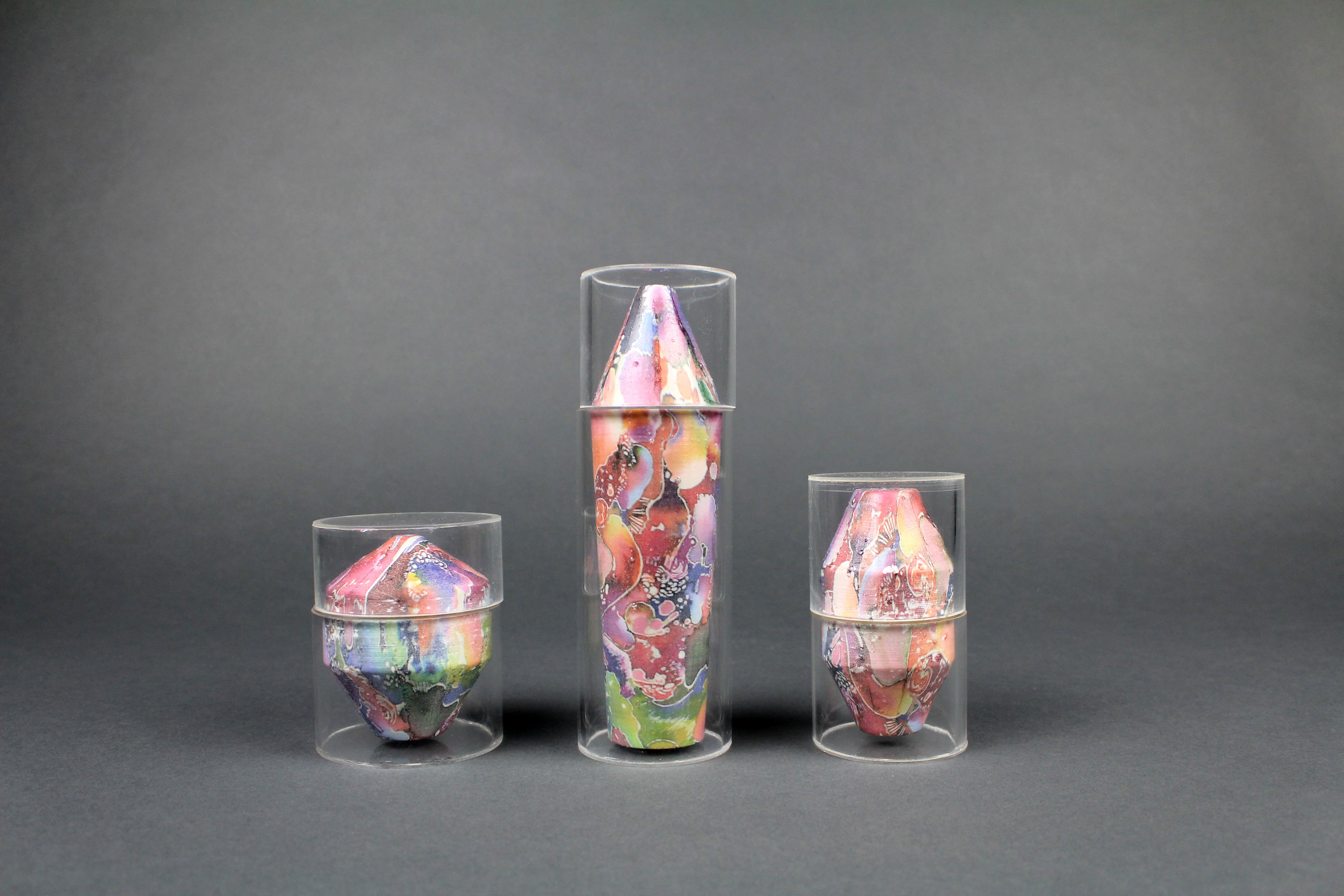
3D models of toner, serum, night cream.
Full shot of the 3D models and box packagings.
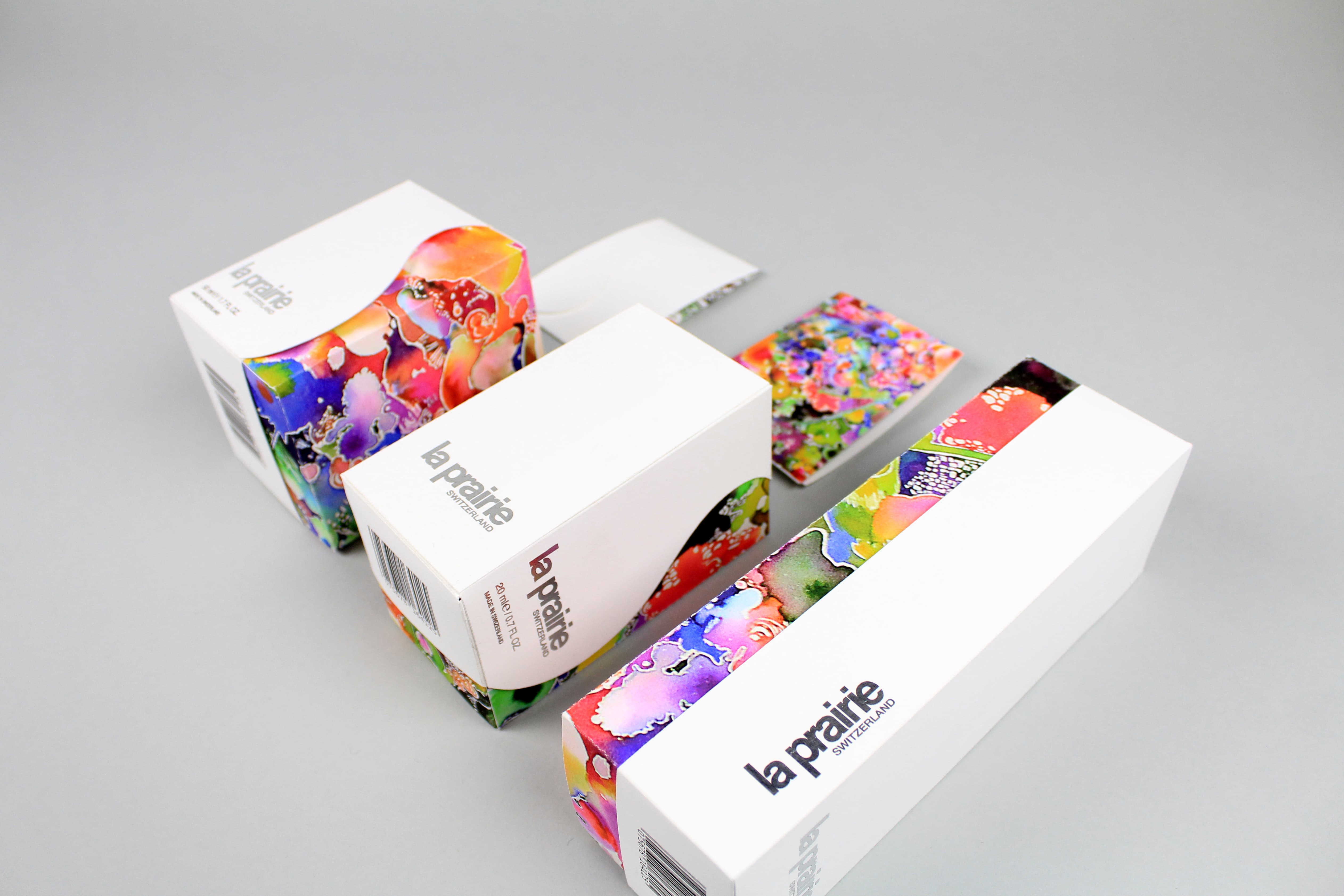
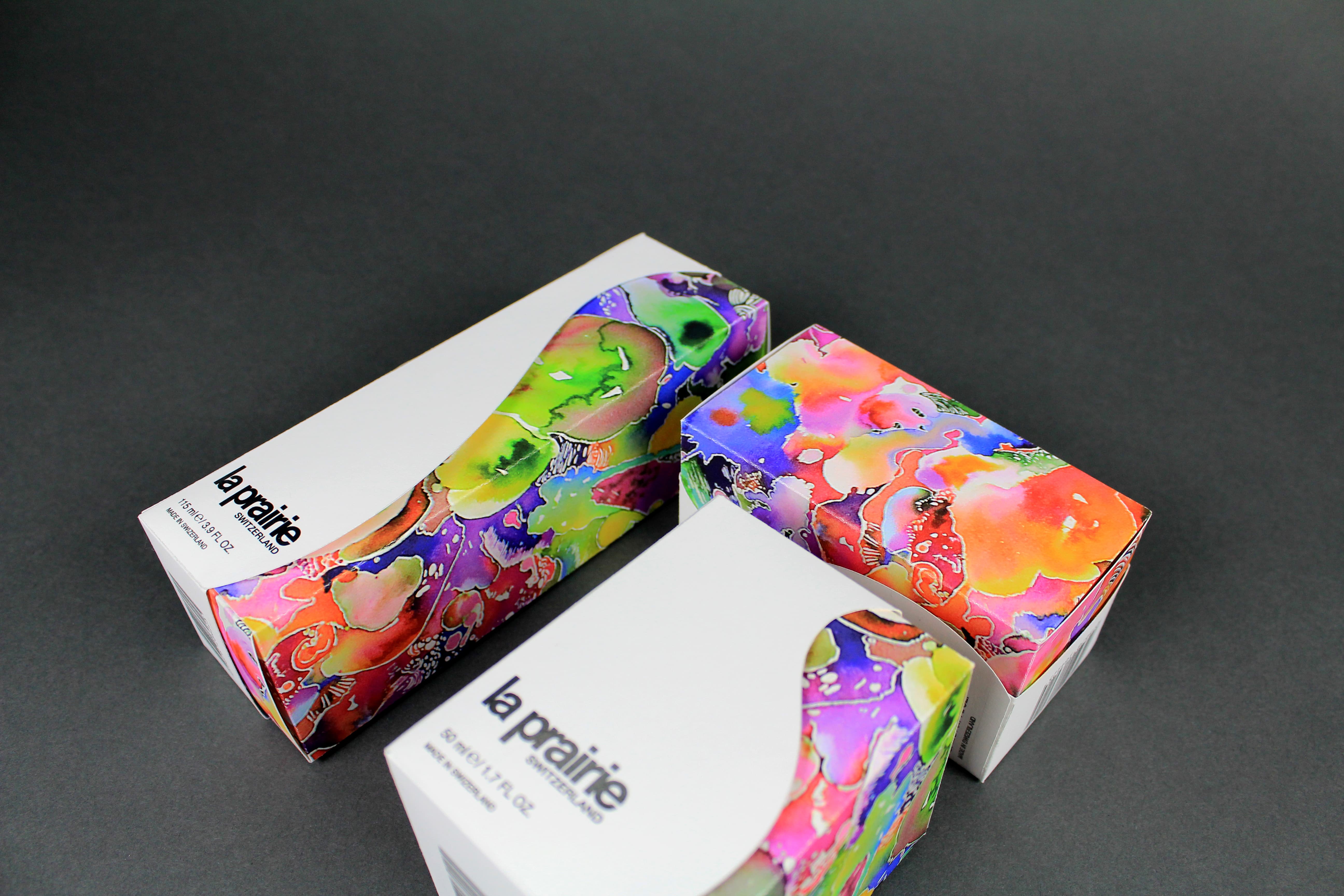
Full shot of Secondary packaging for toner, serum, night cream.
Full shot of Secondary packaging for toner, serum, night cream.
Full shot of Secondary packaging for toner, serum, night cream.
More illustrated packaging for other collections.
More illustrated packaging for other collections.
