Form Follows Taste
Brittany Collins
Form follows function is a familiar design refrain but consider the phrase form follows taste. There is a lack of transparency and distinguishability in food packaging which makes it hard for consumers to know the flavor of a product. This thesis is engaged in developing a system that can be used to visually and tactilely communicate different flavors using texture and form. Words and drawings were collected in a taste test survey and the results influenced the design of each package.
Ginger Mint Lemonade
Words such as strong, powerful, and surprising were used to describe this flavor. I used triangles to convey sturdiness. In addition, many of the drawings included sharp angles and expressed an explosion which is why the depth of the triangles reduce toward the top.
Strawberry Basil Soda
Repeated circles was the trend for this flavor due to the fizzy nature of the soda. The circles were usually accented with dashes or created an image of a splash. As a result, the bottle is an explosion of bubbles to help emphasize the shape of the bottle.
Honey Lavender Milk
When people tasted the milk they felt relaxed which resulted in curving lines and trailing comets. The trend inspired a rounded soft form with a smooth silk texture.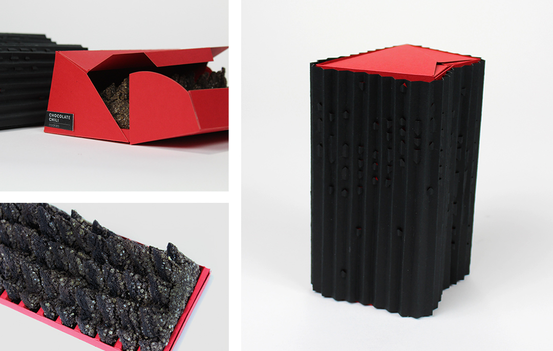
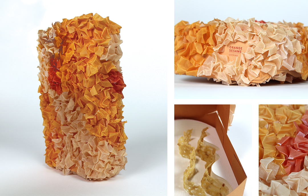
Chocolate Chili Cookies
To Indicate the surprising kick of spice at the end I used a die cut to reveal red peeking through the black. Scribbled vertical lines were repeatedly drawn so I used an accordian fold around the package.
Coconut Curry Meringues
Looping scribbles and cloud like imagery were commonly drawn to describe the melting cloud like sensation. To replicate this feeling I used a twisting form with a soft cushiony fabric.