Interplay of Extremes
Nicholas Fenn
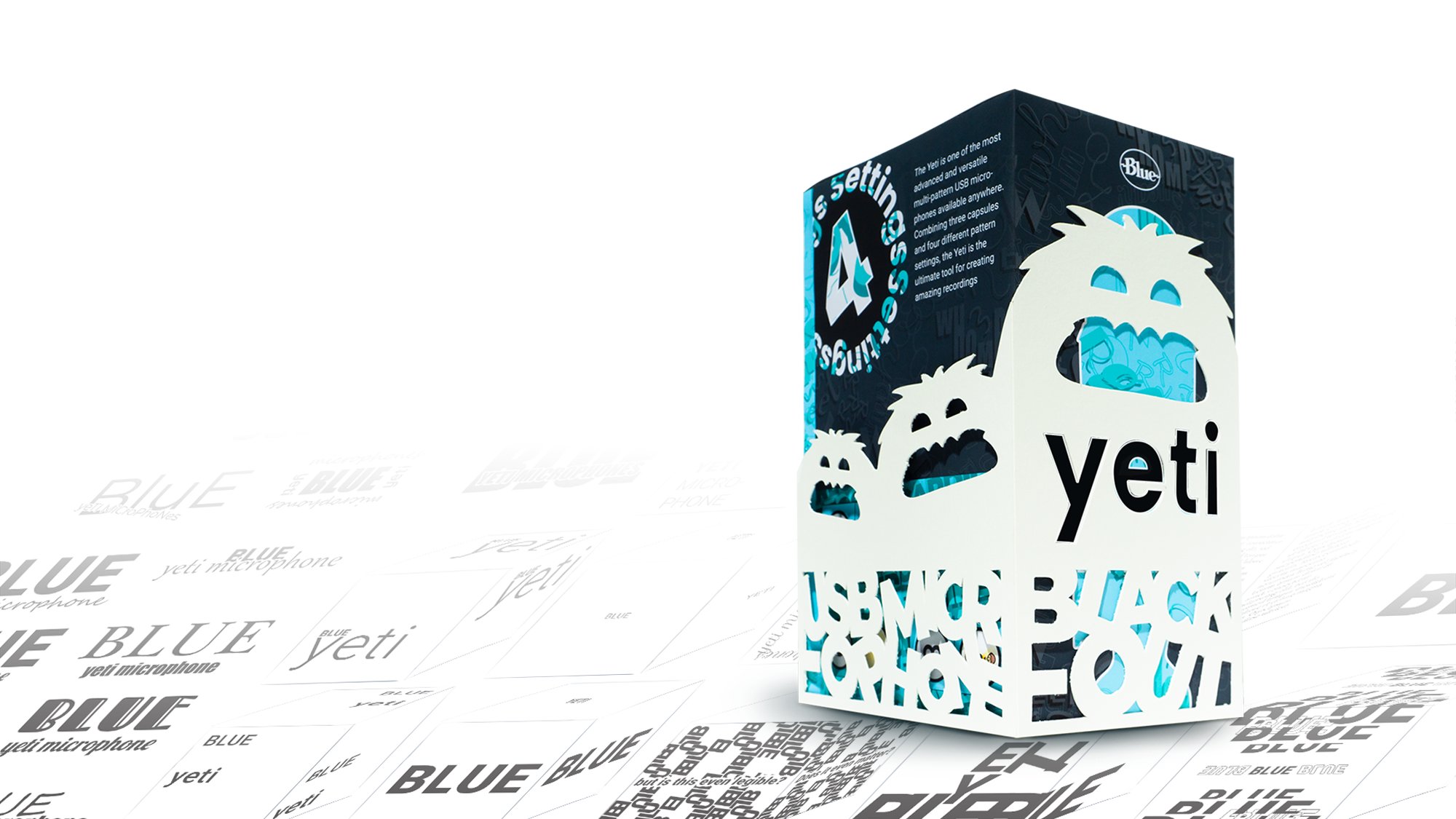
A view into a potential future of graphic design. The past had a dominant influence derived from maximalism while the present is influenced by minimalism. Is there potential in combining what we’ve learned from both rather than fluctuating between these movements? This experiment seeks to answer this question by analyzing how a fully maximalist element interacts with a fully minimalist element in the medium of branded packaging.

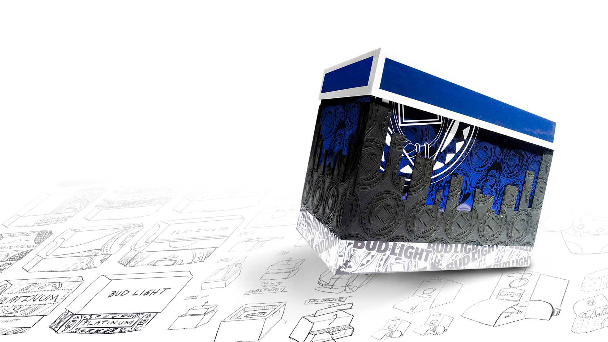
Hierarchy; Figure/Ground Relationship; Opening Experience (Bud Light Platinum)
Minimalist elements tend to act more as a figure where maximalist elements act more as a ground. In hierarchical terms, the eye notices maximal elements first and then quickly moves towards minimalist elements. The opening experience is best when divided in sections of obvious interaction versus unexpected interaction.
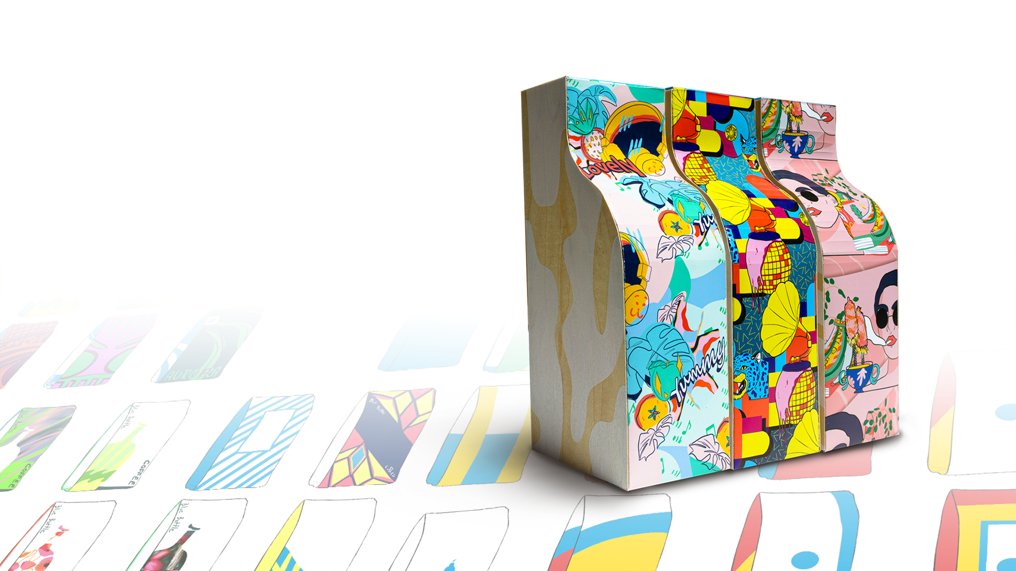
Color; Pattern; Material (Blue Bottle Coffee)
Maximalist color is used to set emotional tone where minimal color is used to hold information. Interpretive patterns are best when left to be decoded by the viewer. They also make their minimalist counterpart (geometric patterns) pop out more. Varying material makes a viewer explore the space.