LOOK, designed for the visually impaired.
Shuairen Wang/Lux
LOOK is a personal care product line uniquely designed for the visually impaired, using purposeful texture, material, and shape of each product.
The product is for all ages.
The embossed symbols have three different types, each of the three bottles is embossed with a distinct symbol, using waves and lines that refer to the shape of the logo.

LOOK chose aluminum and plastic which are environmentally friendly, people can touch them and feel different temperatures. Aluminum normally is colder than plastic. For the shampoo and conditioner, LOOK uses polished and brushed aluminum to differentiable them which allows the user to quickly distinguish the bottle’s contents.

Product in use
For shape, considering the ergonomics, LOOK refined the bottle three times, to make them more suitable for the hand, The body of the three bottles has different indents and the round cap has function as well, the user can hold the cap more comfortably. There is a circular shape on the top of the cap, which implies the user can put their finger on the circular shape and turn on the cap.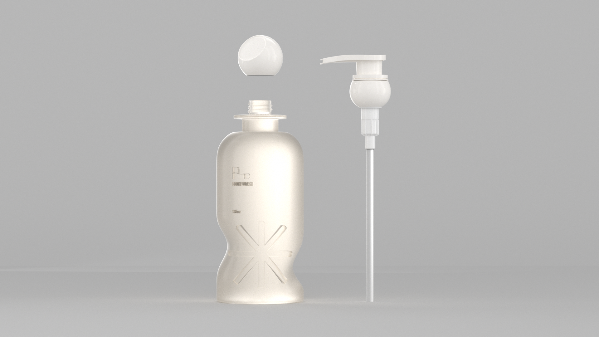
Consumers can turn on the cap and use it directly or use an individual pump, which they can buy separately.

The small information book is a label as well, considering people who would want to know more about the background of LOOK. Here is where I put the brand’s story, instructions for use, and ingredients in the book in a large font to make the book easily accessible.

