The Art of Visual Storytelling and its Impact on Branding
Carly Fyrwald
My capstone research and project explored the art of visual storytelling, its impact on branding, and how it plays a vital role in a brand’s successful communication with and relation to its audience. I chose to focus on brand visual storytelling because it is an overarching concept that requires a range of design skills. Being a quality brand storyteller means being capable of various additional design skills. As such, I wanted to dive deeper into this topic and showcase my versatility in branding through storytelling.
For the project portion of my capstone, I sought to explore the various components of visual storytelling that I had discovered throughout my research and how they can be utilized to establish a strong brand narrative. To do this, I decided to rebrand three well-known companies to demonstrate the impact of visual storytelling in brand messaging. Each brand had its unique set of challenges and opportunities, requiring a tailored process and point of view for each rebrand. This approach allowed me to showcase my creativity and versatility as a designer and strategist and demonstrate my ability to think outside the box.

Motel 6 Rebrand
I selected Motel 6 as one of the companies to rebrand and created a hero illustration featuring the updated logo and color palette. The illustration effectively showcases the entire visual language of the rebrand. Through applying visual storytelling principles in every step of the rebranding process, I developed a cohesive and powerful visual language that effectively communicates the brand’s values and identity.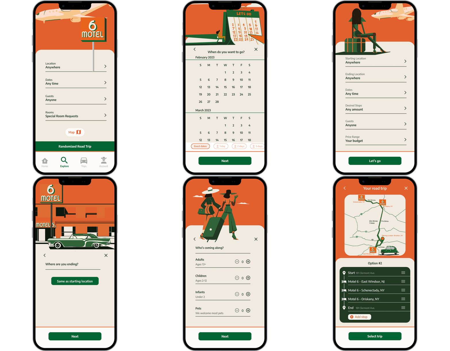
Motel 6 Mobile Application: Randomized Roadtrip
Throughout my rebrand, I aimed to capture the imagination of young, daring, and spontaneous travelers. With this in mind, I developed an updated Motel 6 mobile app, introducing a new concept and feature: The Randomized Roadtrip. This concept embodies the explorer persona while offering the customer the chance to be the main character and storyteller in the Motel 6 brand story.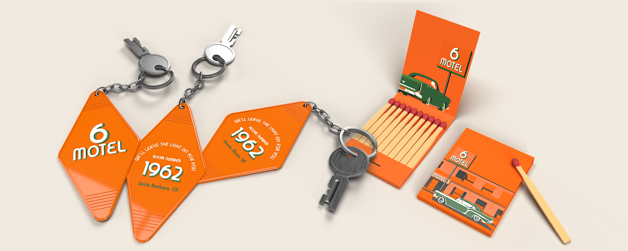
Branded Assets: Room keys and Matchbook
In addition to the mobile app, I created two physical branded assets: a matchbook and motel room keys. The matchbook features the hero illustration of Motel 6, while the keys display the year of the motel chain’s first opening, “1962,” and their iconic slogan, “We’ll leave the light on for you.” These tangible assets serve as a nod to the brand’s history and contribute to cohesively telling the visual rhetoric.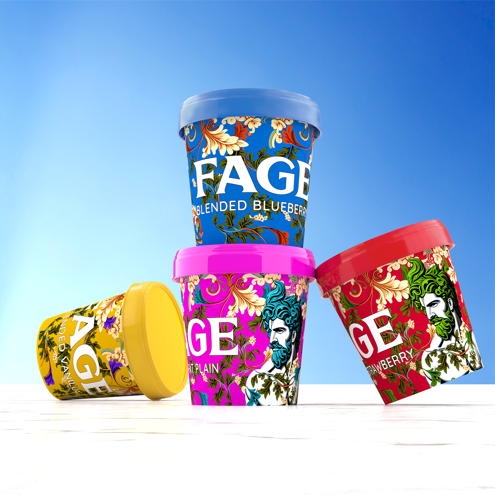
FAGE Greek Yogurt Rebrand
My second rebrand was for the Greek yogurt brand FAGE. Greek yogurt is a versatile and adaptable ingredient that has become increasingly popular in recent years, serving as a healthier substitute for various ingredients in the culinary world. With this in mind, my rebranding efforts sought to showcase the range of flavor, functionality, and creative use of FAGE Greek yogurt through bold visuals and an innovative packaging solution. Each FAGE flavor is thoughtfully designed with a unique color palette, which includes a dominant color for the carton and its complementary color featured throughout the illustrations, all of which contribute to telling the visual narrative.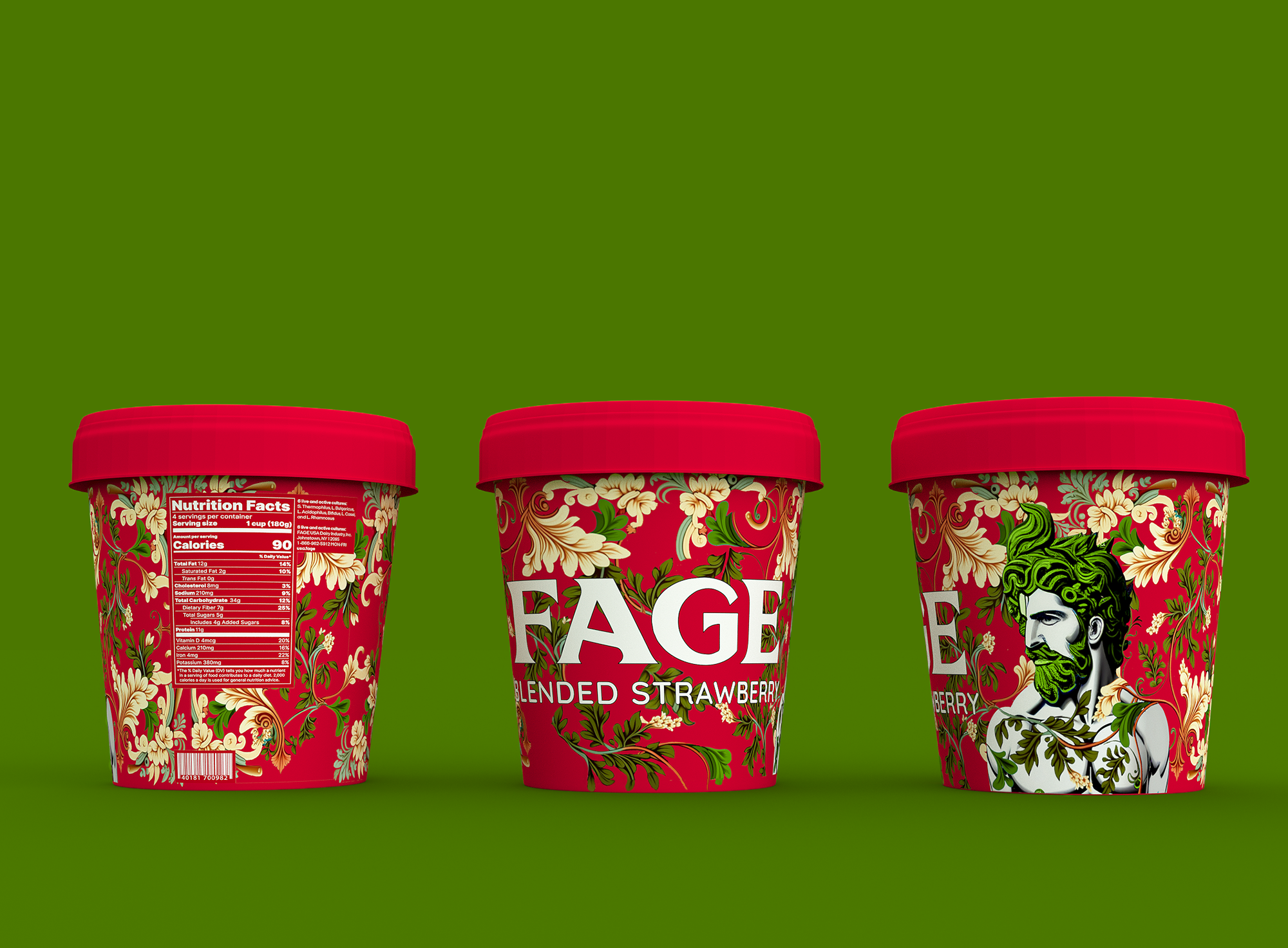
FAGE Large Packaging
For the first packaging solution for my FAGE rebrand, I mainly focused on the visual language by illustrating an intricate Greek floral motif background with a male figure reminiscent of a Greek god. The Greek man’s gaze is noticeably directed toward the FAGE logo and the flavor contained within the package, causing the viewer’s eye to do the same.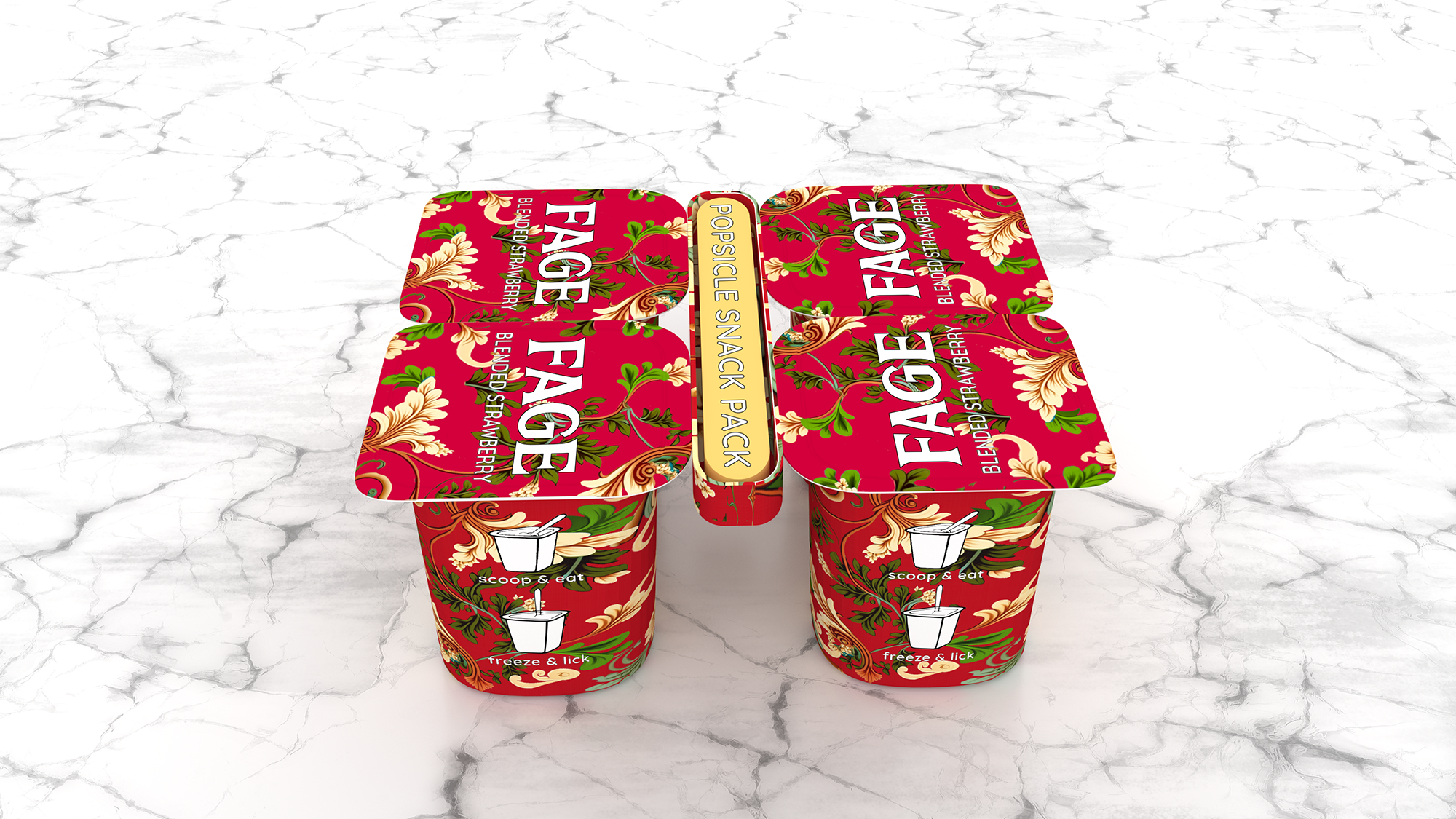
FAGE Popsicle Snack Pack
The second packaging, The Popsicle Snack Pack, features similar visuals to the large, with an innovative two-in-one solution. The packaging features a regular yogurt snack pack but has an additional, specially designed-center compartment that holds four popsicle sticks.
FAGE Popsicle Snack Pack
The packaging is designed so the customer can use the popsicle stick to eat the yogurt as is, or they can stick it in the yogurt and freeze the snack pack for a healthy and refreshing popsicle treat.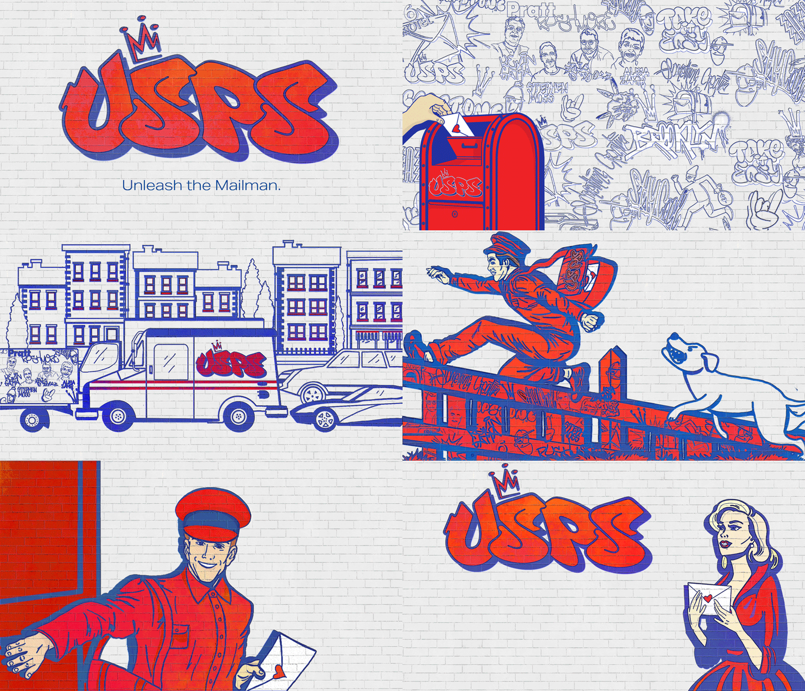
USPS “Unleash the Mailman” Campaign
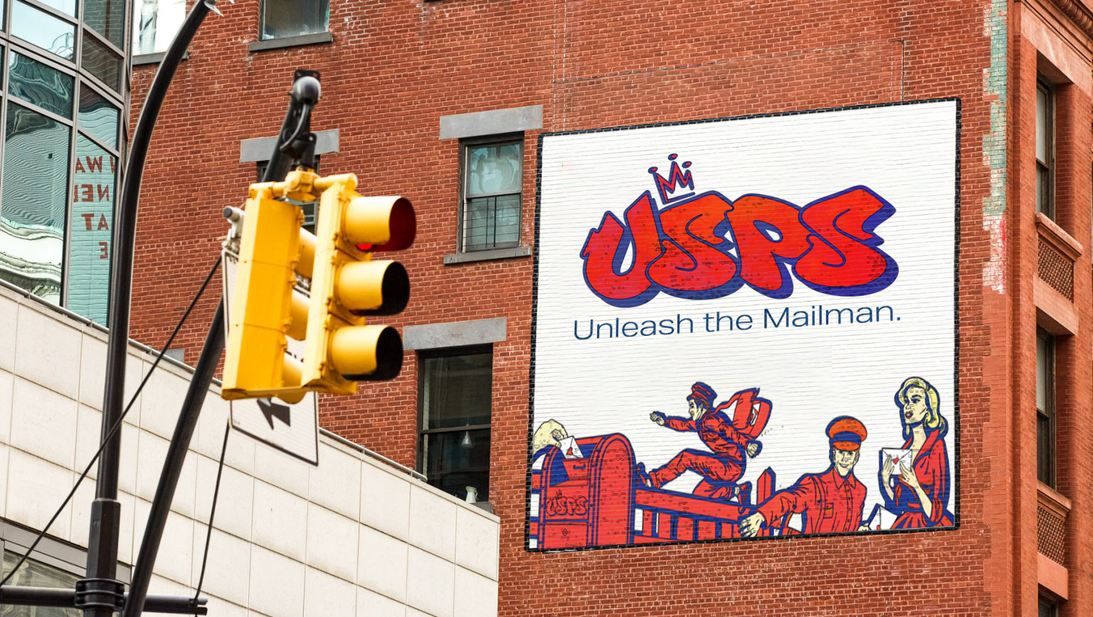
For my third and final rebrand, I tackled the challenge of revitalizing USPS. For this rebrand, I focused on creating the “Unleash the Mailman” campaign, which features illustrations that tell the story of a heroic mailman who goes above and beyond to deliver his mail on time. The story begins with a love letter being dropped into a USPS mailbox and continues to unfold with the mailman finding himself in a precarious situation: gridlock traffic. He abandons his truck and races on foot through yards, dodging dogs and jumping fences - the mailman has been unleashed. He finally arrives at his destination with the love letter intact and in hand. The story ends with USPS saving the day and delivering the love letter to the rightful recipient.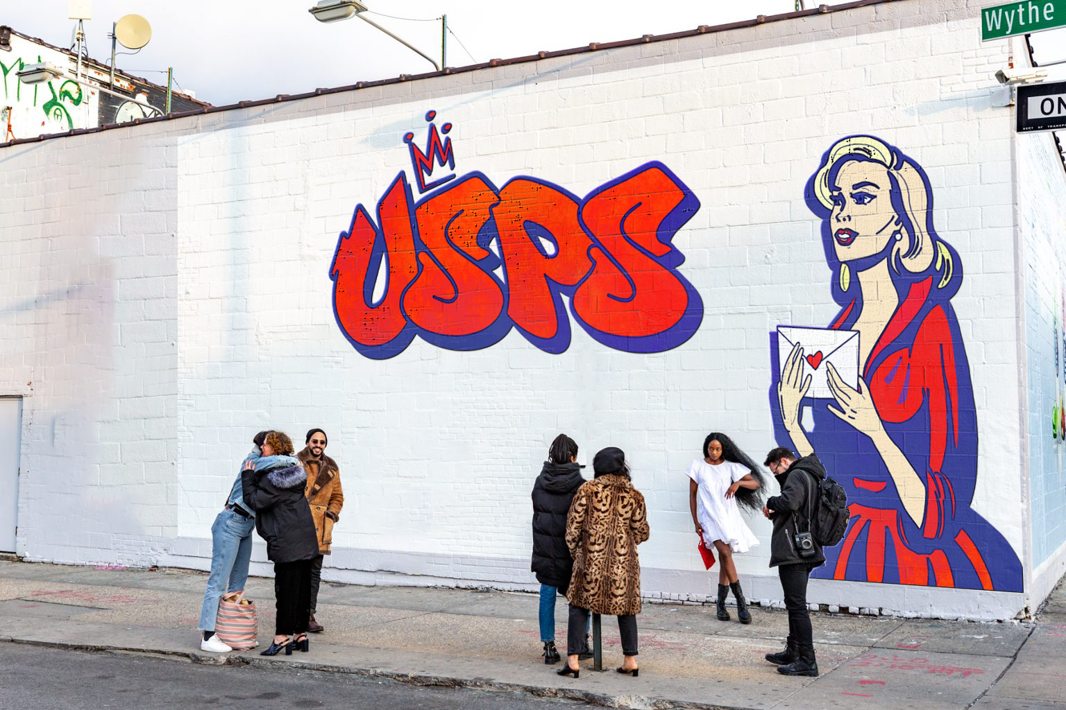
Love Letter USPS
The illustrations for the “Unleash the Mailman” campaign would be painted as murals around the city. They are designed to function as a cohesive system to contribute to the larger narrative, but they can also be appreciated individually without needing the full context of the campaign.