Wayfinding for Reactance - Design for Dark Tourists
Hailey Isaacs
The purpose of this wayfinding system is to keep dark tourists, who have thrill seeking personalities, informed about the dangers they could face by breaking the rules. How does one design for people who are motivated by defiance?
wayfinding-for-reactance.webflow.io
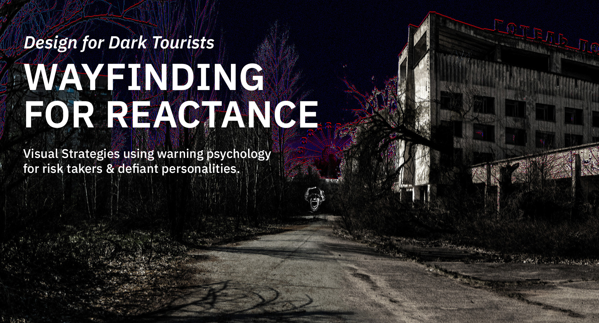
Wayfinding For Reactance
A visual language with a symbol system based on instincts will help people find their way in foreign or emergency situations. By studying wayfinding systems, fear and anxiety instincts, horror cinematography, and global symbols, I have come up with a wayfinding system for dark tourists. Reactance theory states that people will want to do what they are told not to do. If something is labeled as ‘off limits’, they are compelled to go there, even if it wasn’t their idea.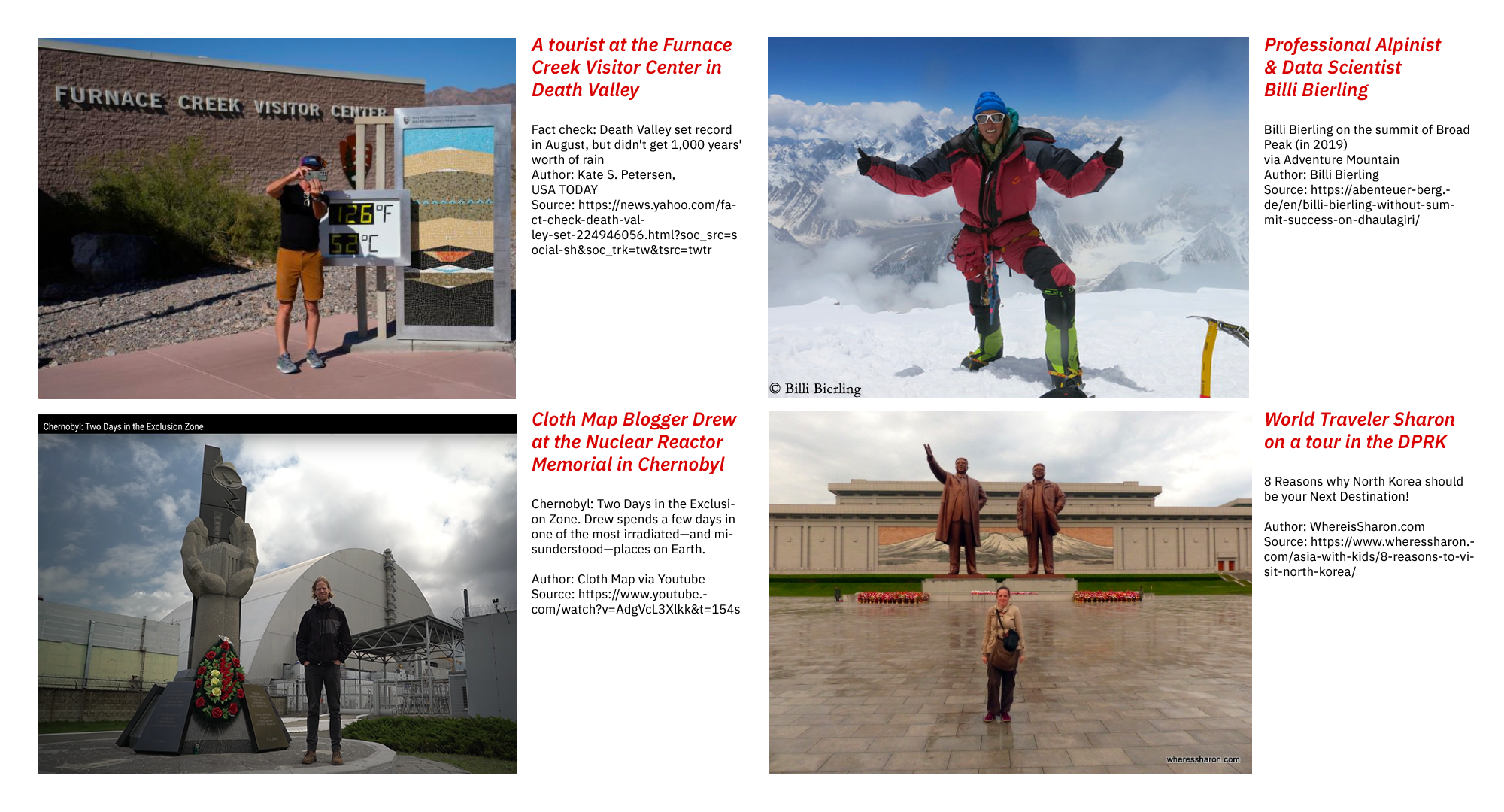
Dark Tourists - What is Dark Tourism?
People are intrigued by disturbing and dangerous places. When traveling, tourists do not always know the social norms, dangers, language, or go out of their way to purposely do something dangerous for the thrill. Dark Tourists travel to places they are curious about and are associated with death or tragedy.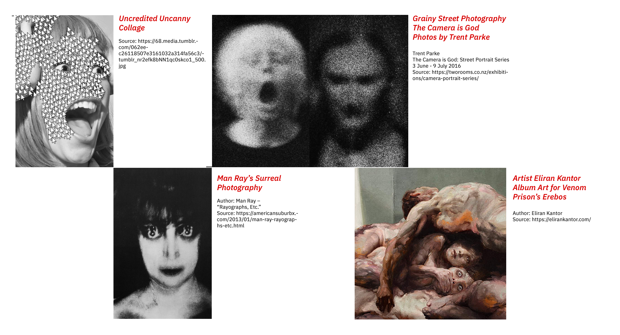
Inspiration From Horror Themes
I investigated the types of imagery that is successfully used in horror cinematography and art and found our instincts find fear in ambiguous faces or something almost human, uneasiness with a 19hz vibration infrasound, uncomfortable visual dissonance, and a strategic use of negative space where it seems something is looming in the emptiness.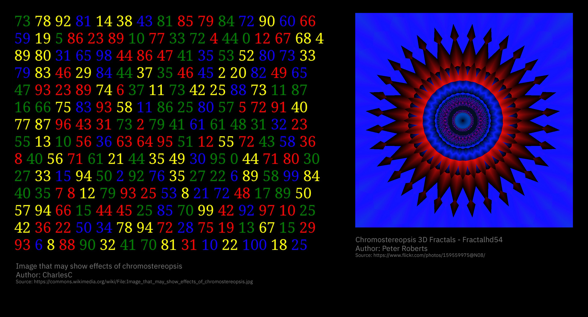
Chromostereopsis Effect for Visual Discomfort
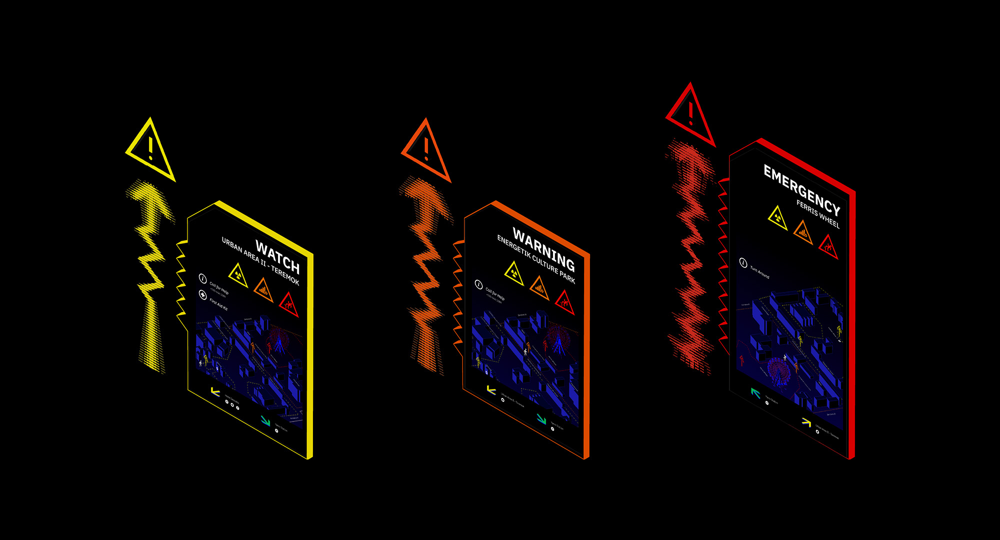
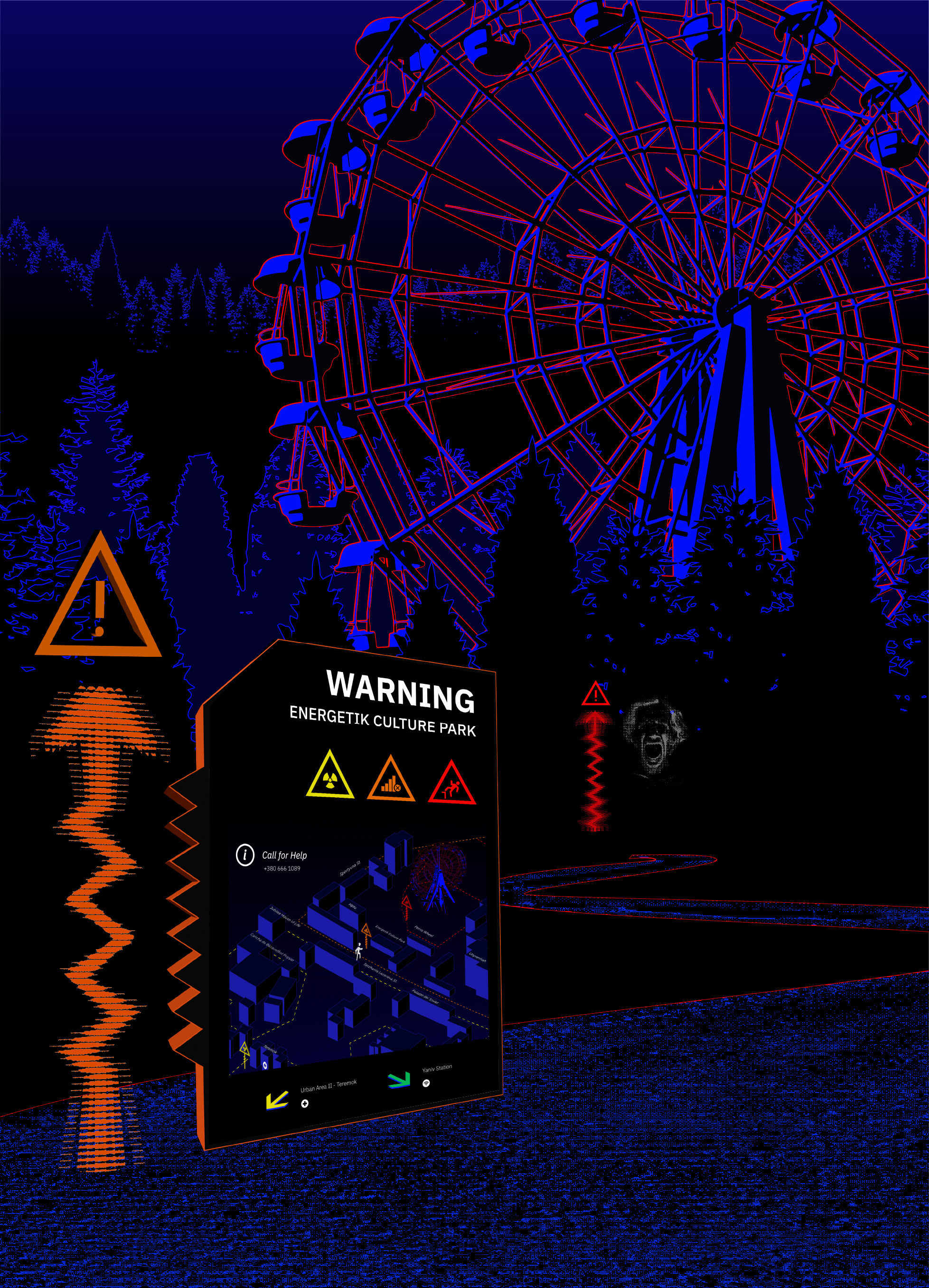
Solution - Checkpoints Indicating Level of Danger
A wayfinding system with a series of checkpoints that invoke fear and anxiety will get tourists to turn around. Landmarks and checkpoints are key to wayfinding design. People make decisions based on perceived risk, compliance cost, and social decision making factors. A cohesive brand style and system gives communications credibility because they are familiar.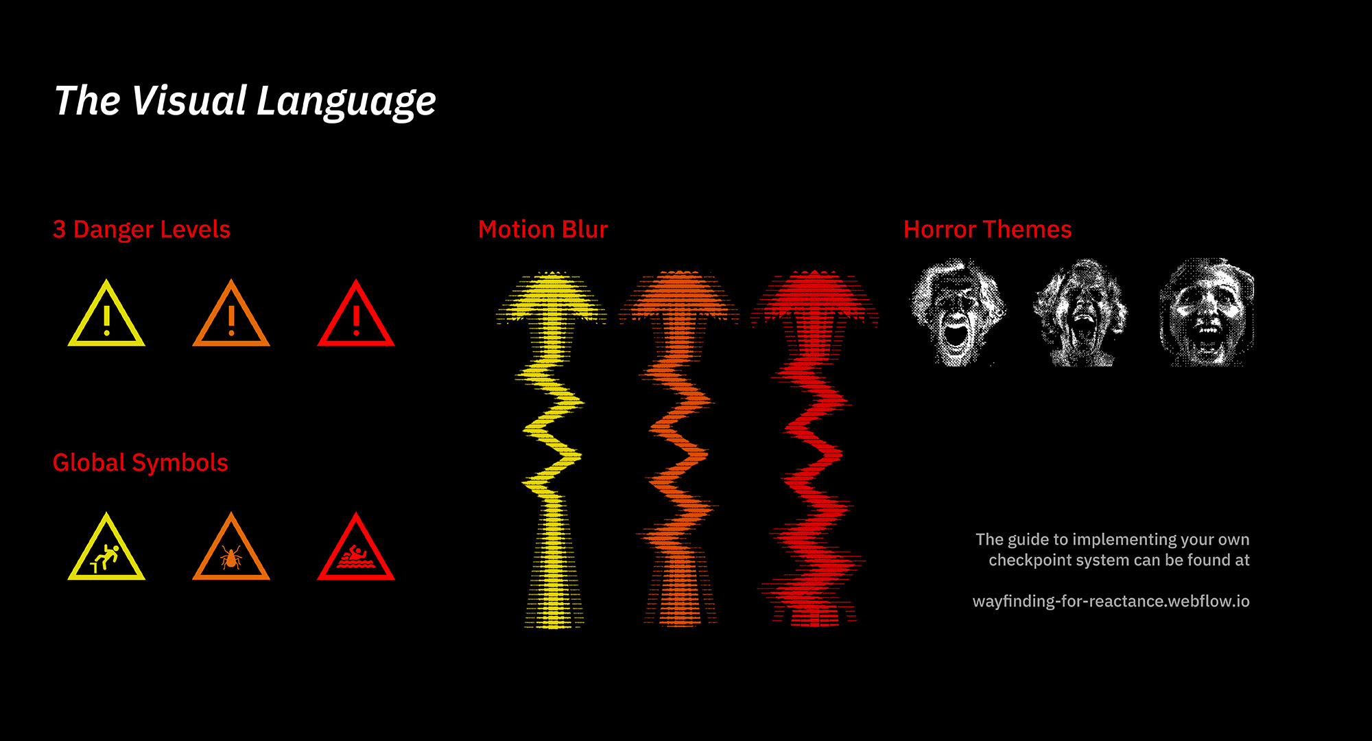
The Visual Language
A gap in knowledge is one of the reasons people are curious, global warning symbols help viewers determine the risk. In addition to warnings, it is helpful to include a beacon for lost tourists to navigate to. Include the most basic global symbols. The caution symbol is used throughout the checkpoint design and is used for general dangers from a distance. A color is associated with each level of danger. The meaning of the color will indicate the level of severity when applied to a symbol. Assuming a warning is understood a user must decide whether or not to comply. This depends on factors such as perceived risk, or an alternate route. Arrows indicate risk severity with apparent motion blur. Ghostly faces are used to invoke a feeling of the uncanny to put even the bravest of tourists on edge. Sitting in front of only the emergency level checkpoint, a lenticular reveals the warning information only at close distances.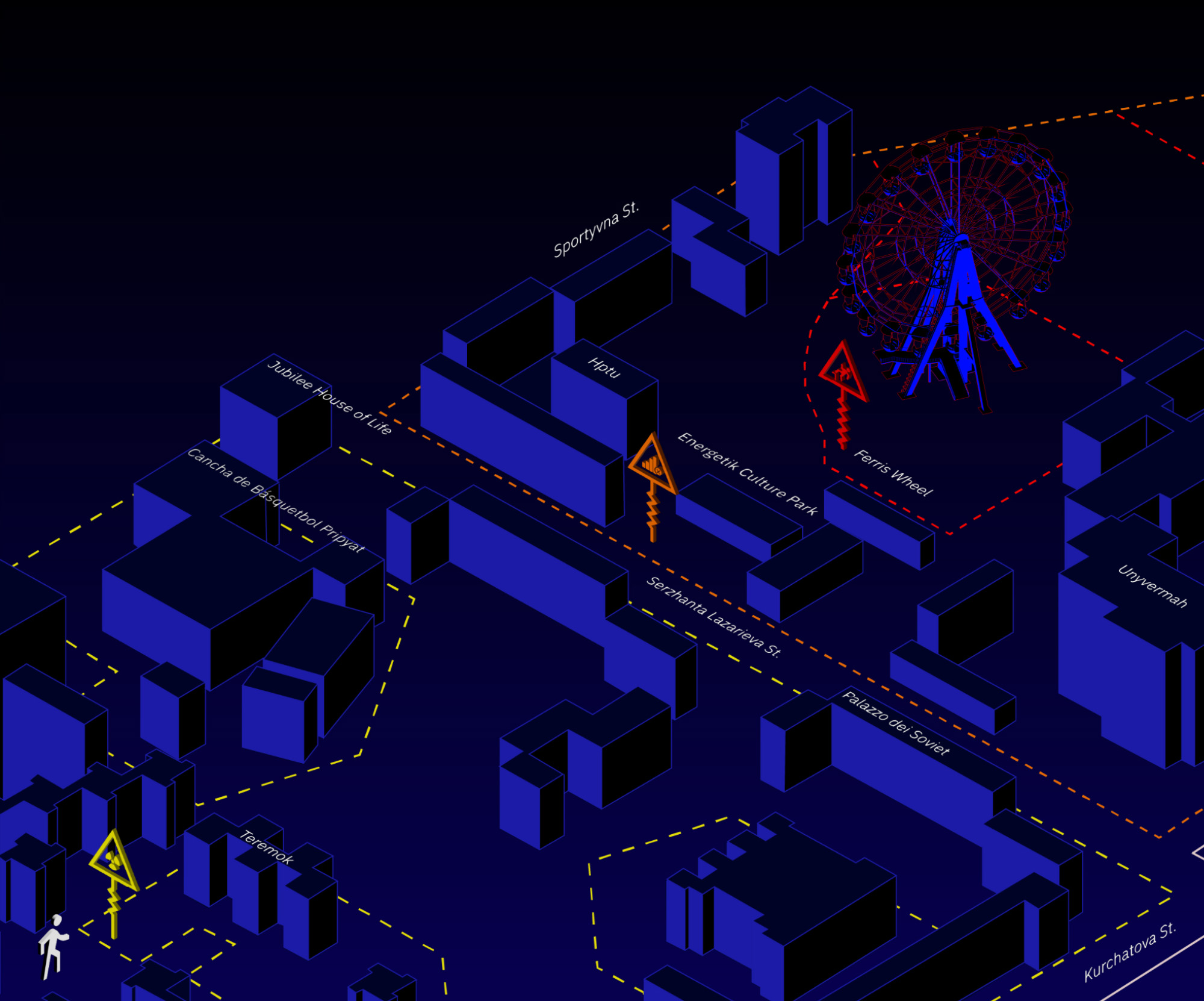
The Map
Since every location is different, specific warnings are provided in context. A 3D map removes any ambiguity from the symbol warnings. An isometric view shows no distortion and allows the viewer to know exactly where they are.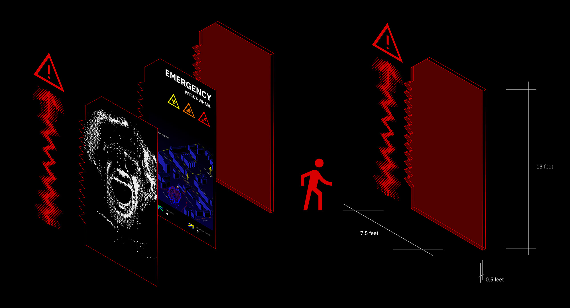
Checkpoint Explosion
Checkpoints are designed to be viewed at a distance, therefore they are from 10 - 13 feet tall. The Emergency level checkpoint is the tallest, indicating it is the most serious and severe to approach. Information that can be viewed from a farther distance is most important.