Designing Perceived Luxury: How Packaging Cues Drive Value
Xue Guo
Designing Perceived Luxury explores how packaging design shapes contemporary luxury through material perception, tactility, ritual, and sensory experience. Through case studies, consumer research, and biomaterial experimentation, the project investigates how packaging cues construct emotional and perceptual value beyond material excess alone. The final design proposals further explore how biomaterials may communicate refinement, atmosphere, intimacy, and contemporary luxury through sensory interaction and the integration of material characteristics with design language.
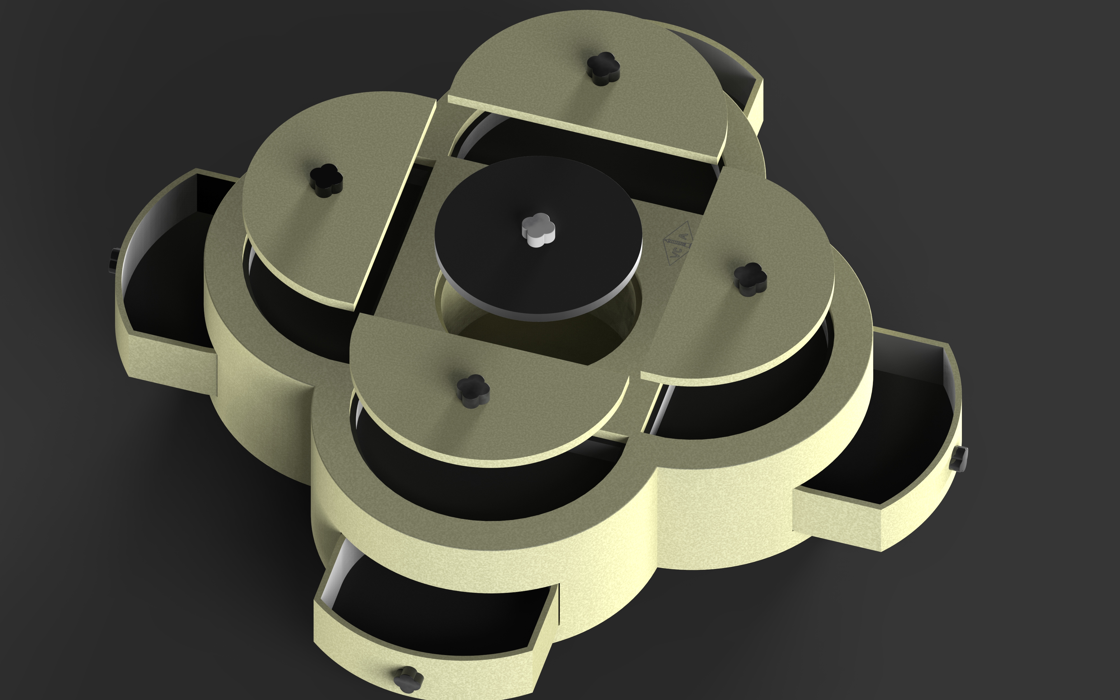
Van Cleef & Arpels Bio-Based Velvet Textile Jewelry Box Concept
The Van Cleef & Arpels jewelry box proposal uses Bamboo Velvet as its primary material to reflect the brand’s soft, elegant, and emotionally driven luxury language. Compared to traditional synthetic velvet materials, bamboo velvet preserves delicate sheen and soft tactile qualities while also aligning more closely with contemporary luxury values centered on sustainability and emotional experience. The sense of softness, comfort, and intimacy created by the material resonates with the delicate and ritualistic experience of wearing jewelry, further reinforcing a slower and more emotionally immersive atmosphere.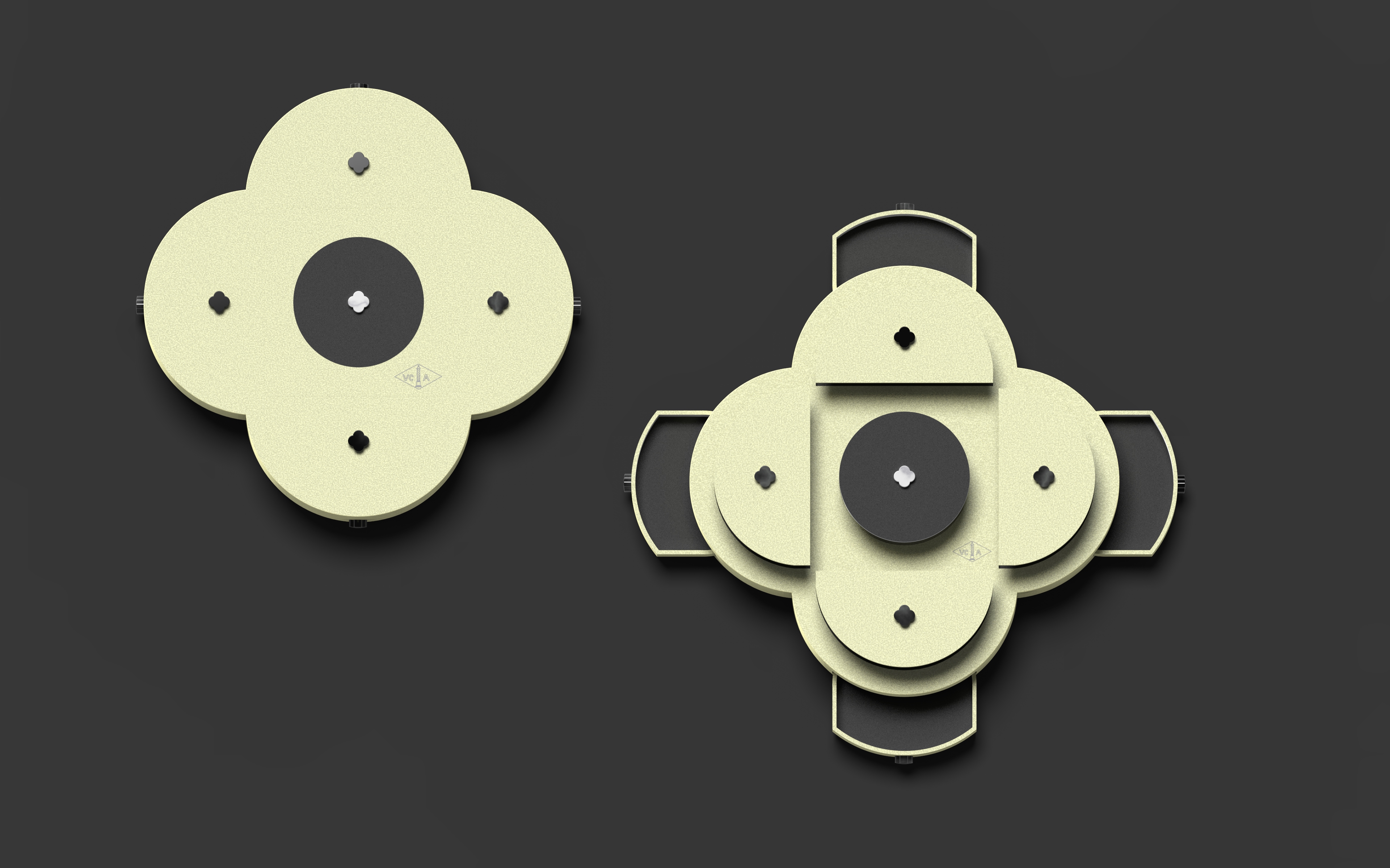
Structural Packaging Design
The packaging structure extends Van Cleef & Arpels’ iconic clover motif and signature brand color, transforming them into the structural language of the jewelry box itself. Soft curves and a wrapped opening system strengthen the ritual and emotional value of the unboxing experience while preserving the brand’s classic sense of elegance. By combining bamboo velvet material with the brand’s existing fine jewelry language, the project explores how sustainable materials may continue to communicate softness, refinement, and premium perception within contemporary luxury culture.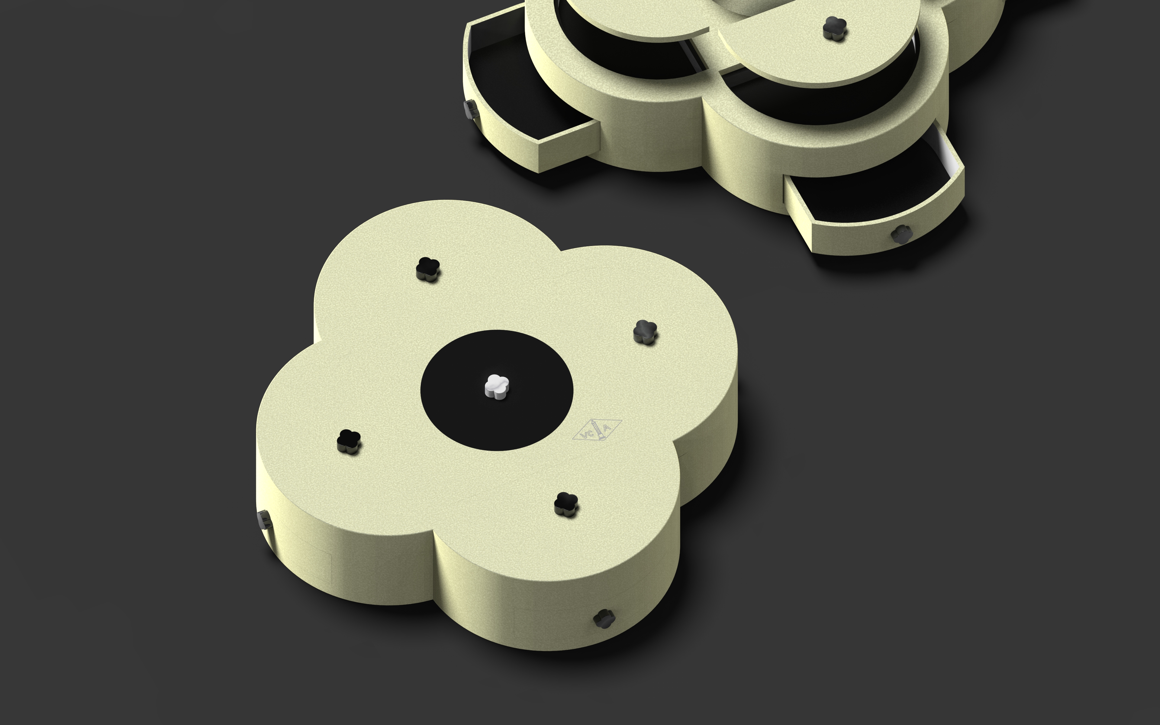
Design Details Align with Brand Language
The lifted handle elements are also designed using the clover motif, reinforcing the brand’s iconic visual language throughout the packaging system. Their scale, rounded proportions, and glossy texture subtly reference Van Cleef & Arpels’ signature Alhambra collection, particularly the recognizable mother-of-pearl clover jewelry pieces. The central cylindrical storage area is finished in black, while the surrounding structure adopts the brand’s signature soft green tone, creating contrast while further echoing the visual composition of the brand’s gemstone and diamond jewelry pieces. The silver foil stamped logo complements the velvet-like surface texture, allowing small details to communicate a quieter and more understated form of luxury.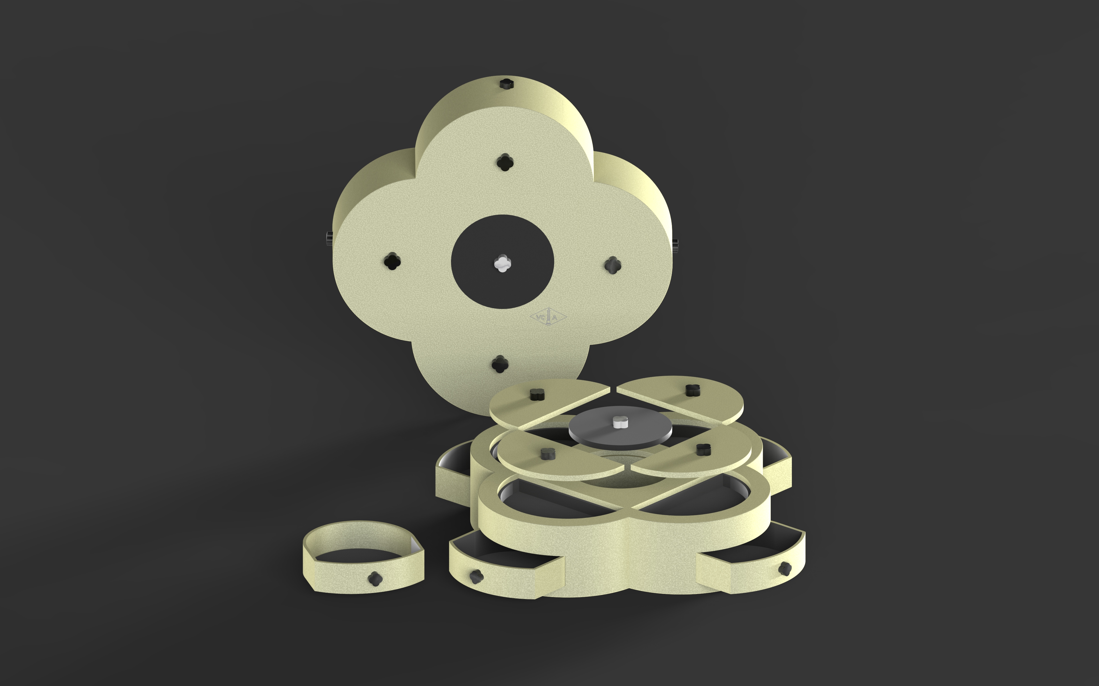
Storage and Collectible Experience
The double-layered four-sided structural system creates separated compartments for jewelry storage, strengthening both functionality and presentation. The symmetrical structure and balanced proportions create a calm and elegant visual presence while making the packaging more suitable for long-term storage, organization, and collectible display. The open central space extends through both structural layers, adding greater spatial complexity and visual depth to the packaging system while subtly referencing Van Cleef & Arpels’ renowned craftsmanship and intricate stone-setting techniques.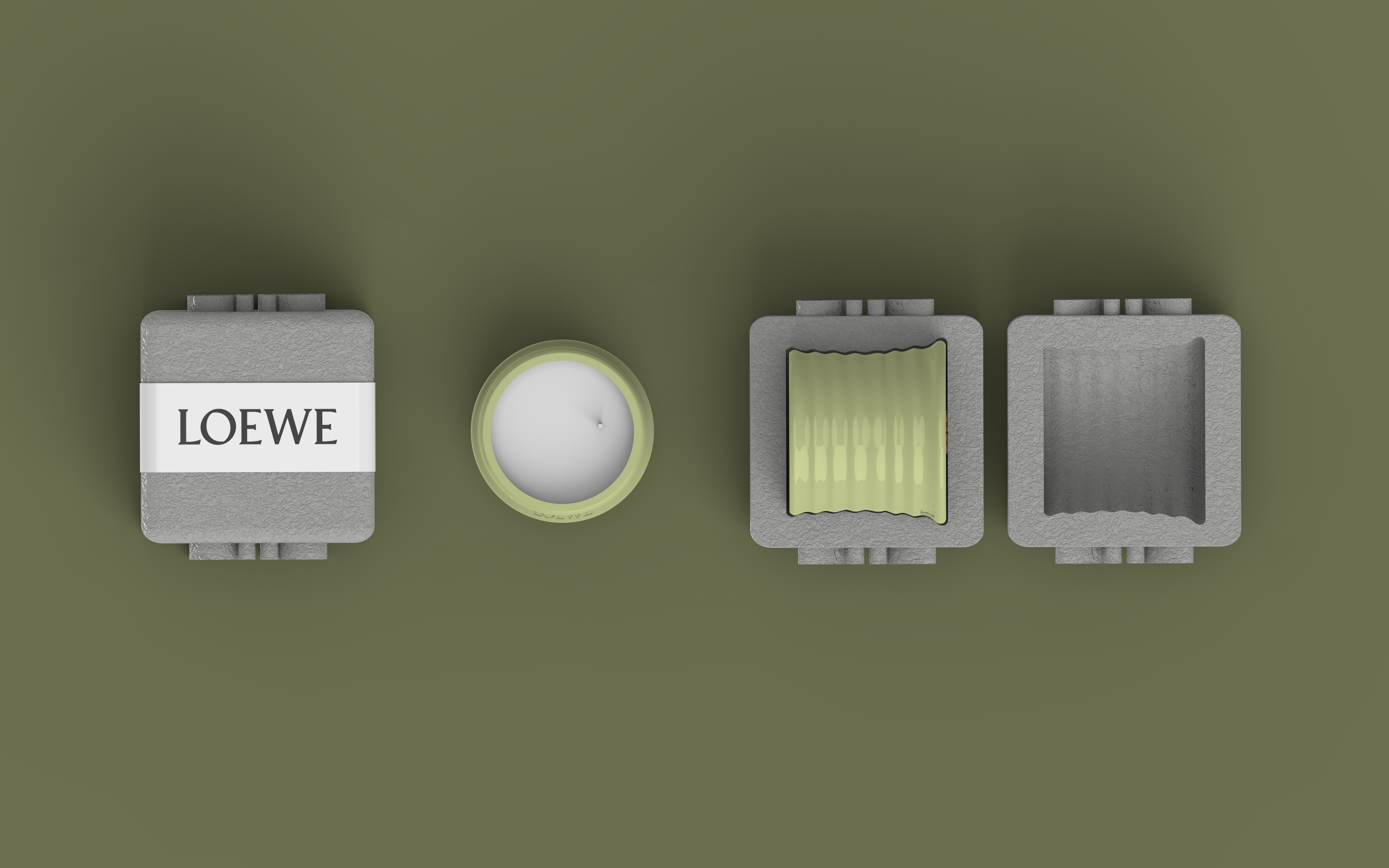
LOEWE Mycelium Packaging Concept
The LOEWE candle packaging proposal uses mycelium material to reflect the brand’s focus on tactility, craftsmanship, and sensory lifestyle experiences. Through natural textures, organic irregularities, and visible traces of growth, the material creates a quieter and more contemporary form of luxury. The disappearance created by the burning candle, together with the slow growth process of mycelium itself, both represent the passage of time. The texture and tactile quality of the material encourage consumers to slow down and become more aware of sensory experience and emotional pacing during interaction.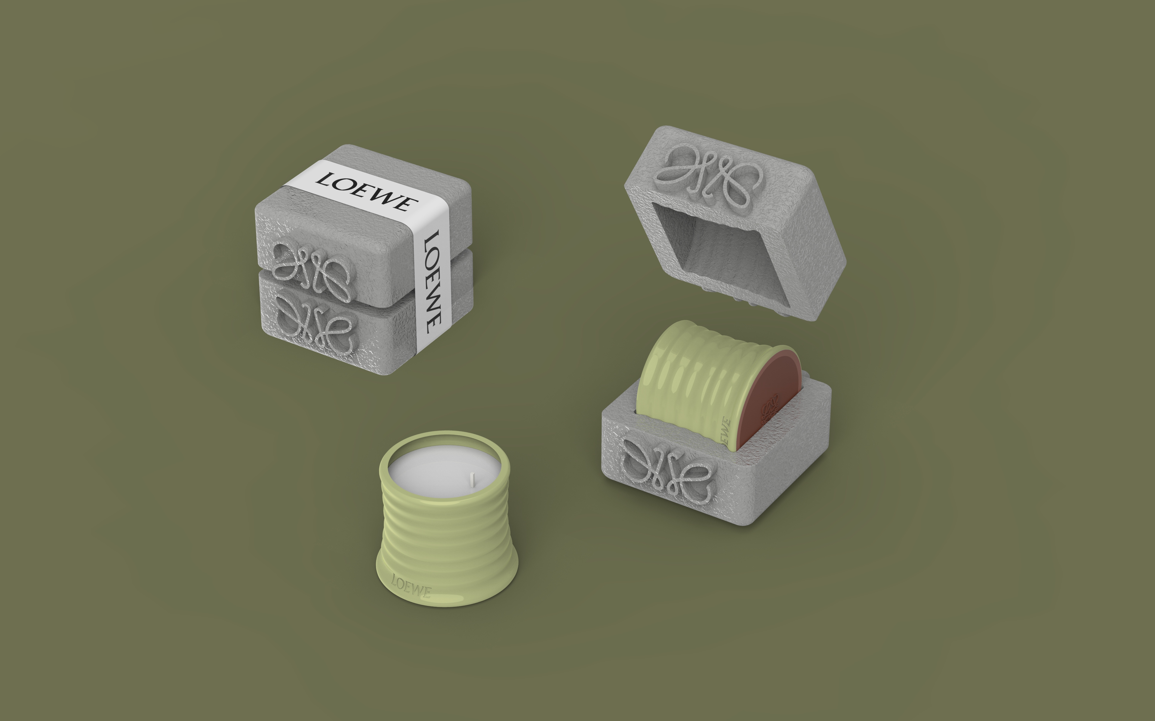
Candle‘s Packaging Structural Design
The sculptural structure extends LOEWE’s artistic design language while allowing parts of the candle to remain visible, further extending anticipation and interaction throughout the unboxing experience. The outer paper band references LOEWE’s existing wrapping and labeling language, reinforcing both functionality and a sense of gifting ritual. By combining biomaterial texture with intentional packaging design cues, the project explores how sustainable materials may continue to communicate warmth, atmosphere, and premium perception within contemporary luxury culture.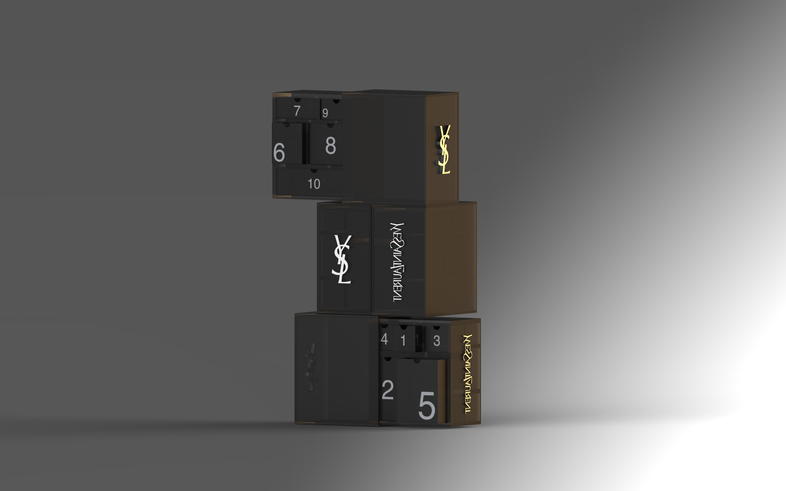
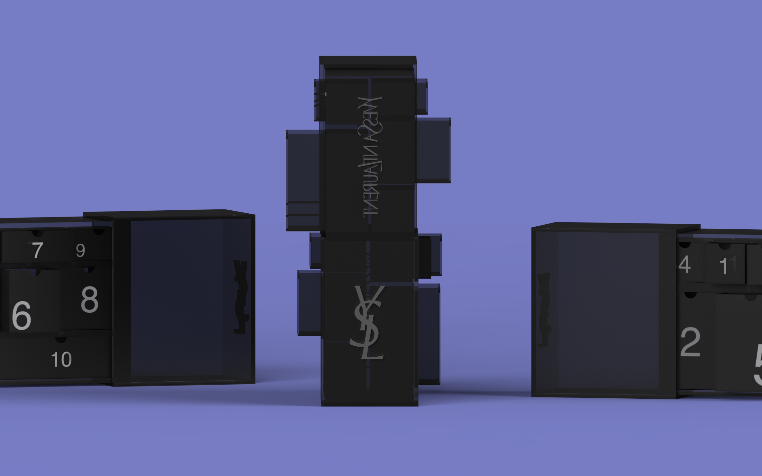
Yves Saint Laurent Bio-Based Transparent Polymer Advent Calendar Gift Box Concept
The Yves Saint Laurent Beauty advent calendar packaging proposal uses Cellulose Bioplastic, a bio-based transparent polymer material, as its primary material to reflect the brand’s modern, bold, and contemporary luxury identity. Unlike conventional petroleum-based acrylic materials, cellulose bioplastic preserves translucency and smooth reflective qualities while introducing a more sustainable material direction. The semi-transparent surface allows light, shadow, and depth to become part of the packaging experience, reinforcing themes of atmosphere, nightlife, and emotional interaction associated with contemporary beauty luxury.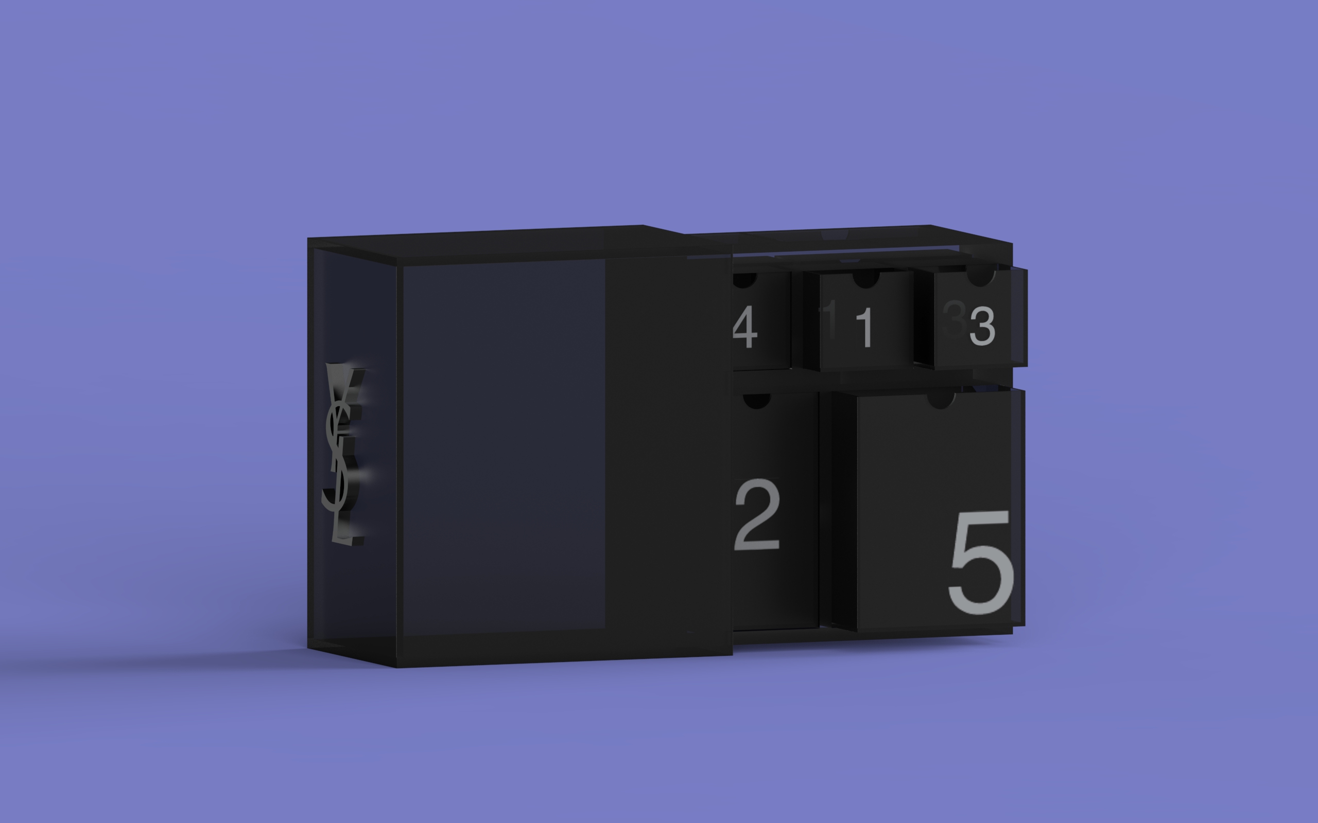
Structural Packaging Design
The structural concept transforms the advent calendar into a sculptural object rather than a temporary seasonal package. Inspired by Yves Saint Laurent Beauty’s geometric visual language and architectural product forms, the packaging uses modular compartments and layered drawer systems to extend interaction and anticipation throughout the opening experience. The daily ritual of opening an advent calendar naturally introduces a slower sense of counting, waiting, and emotional pacing, encouraging consumers to slow down and engage more intentionally with the experience. The repetitive opening sequence further strengthens a slower and more ritualistic relationship between the user and the product.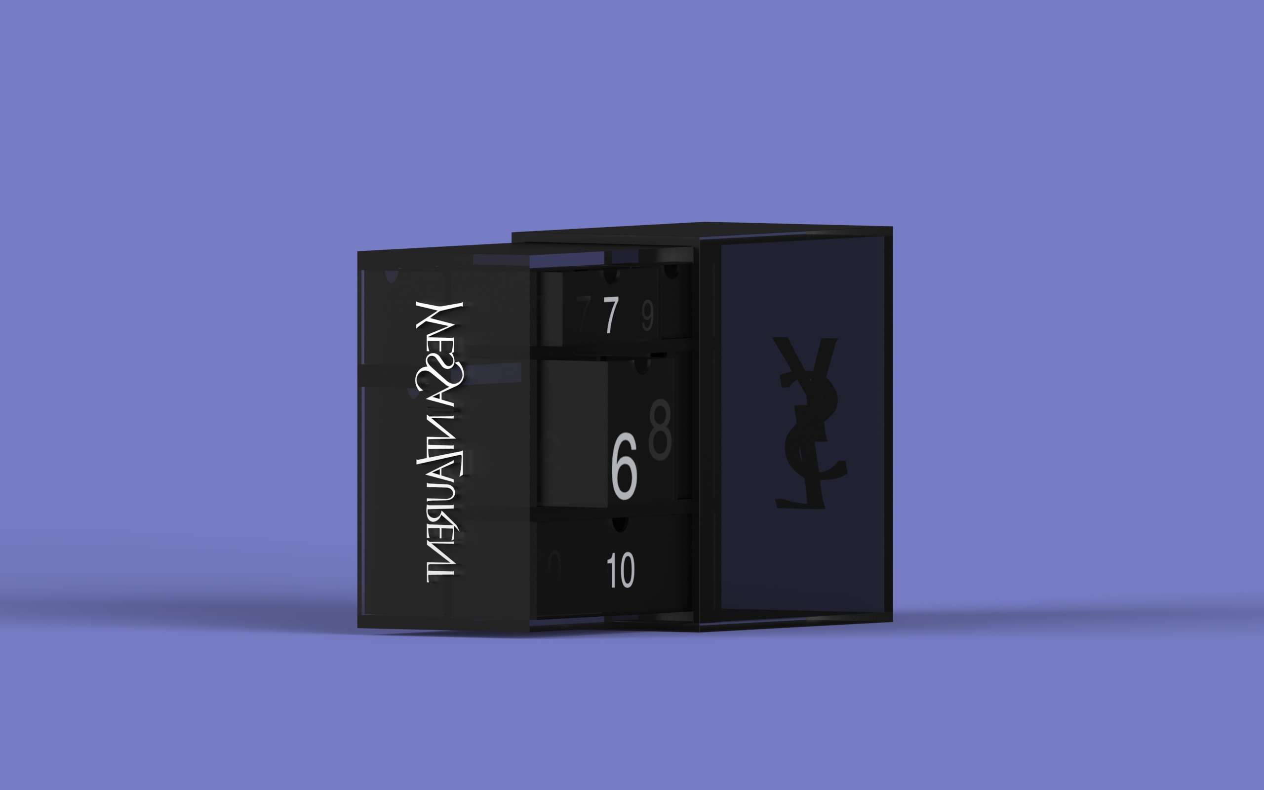
Visual Identity and Brand Language
The visual language combines black translucent surfaces, reflective material contrast, and silver branding details to align with Yves Saint Laurent Beauty’s iconic cosmetic identity. The transparency of the material allows portions of the internal structure and numbered compartments to remain partially visible, creating visual depth while maintaining a refined and minimal appearance. The contrast between opacity and translucency reflects the brand’s balance between elegance, sensuality, and modern edge.